Notely: Making an abstract AI product clear enough to join the waitlist.
Making an abstract AI product clear enough to join the waitlist.
- Category
- Web Design · Framer · AI Concept
- Industry
- Software / SaaS · Artificial Intelligence · Business Productivity · Startups
- Design scope
- Web Design · Framer Development
- Year
- Concept
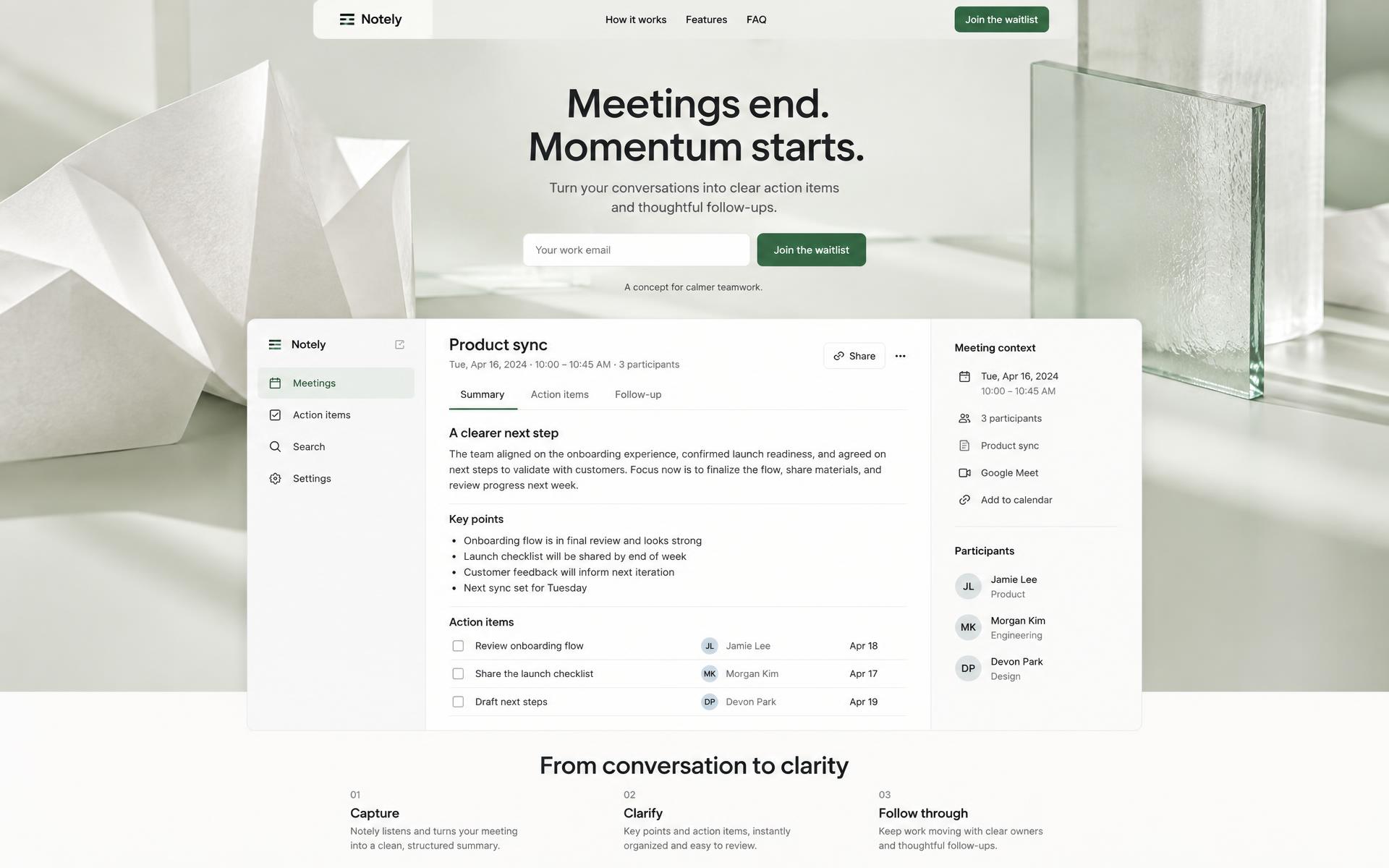
A self-initiated landing page for Notely, a fictional AI tool that turns meetings into action items and follow-up emails. Not a paid client order.
01 — The idea & challenge
The meeting ends. The next steps should be clear.
Notely is a fictional AI meeting-notes tool for startup founders and team leads. The landing page’s job was to explain the promise quickly and invite visitors onto a waitlist.
This was a self-initiated design-and-build concept, not a paid client project. With no real customer results to show, the page needed to earn interest through clarity rather than invented stats or testimonials.
Visuals in this case study are newly AI-generated concept illustrations and reconstructed wireframes, not evidence of a live AI tool or screenshots of the delivered Framer site.
02 — Structure before styling
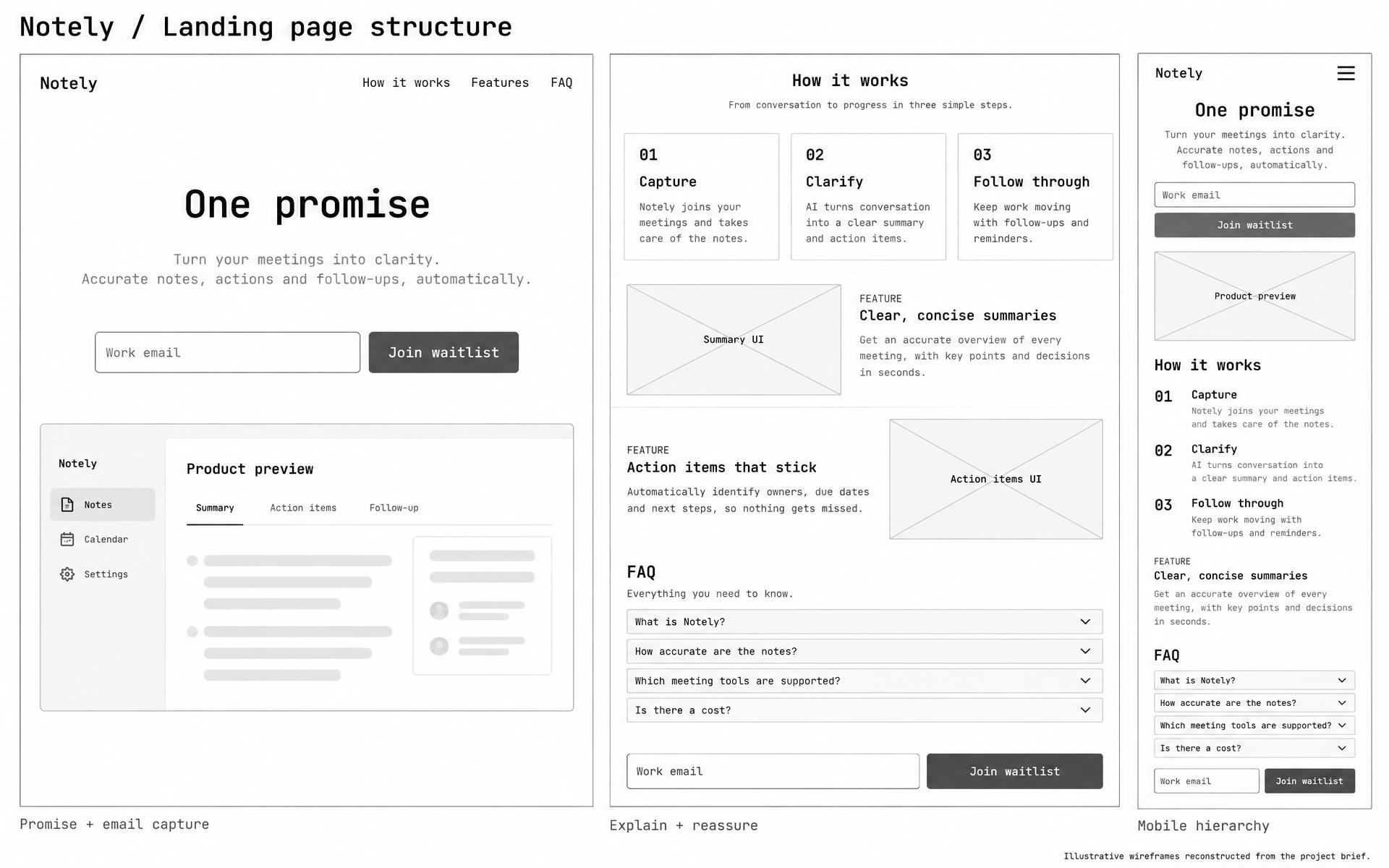
One promise. One action. A short path to understanding.
The structure puts a clear hero promise and email capture first, then explains the product in three steps. Feature blocks show the proposed output, an FAQ addresses questions, and a repeated CTA gives visitors another chance to join after exploring.
- Promise
- Email capture
- How it works
- Feature previews
- FAQ
- Waitlist CTA
03 — Make the AI tangible
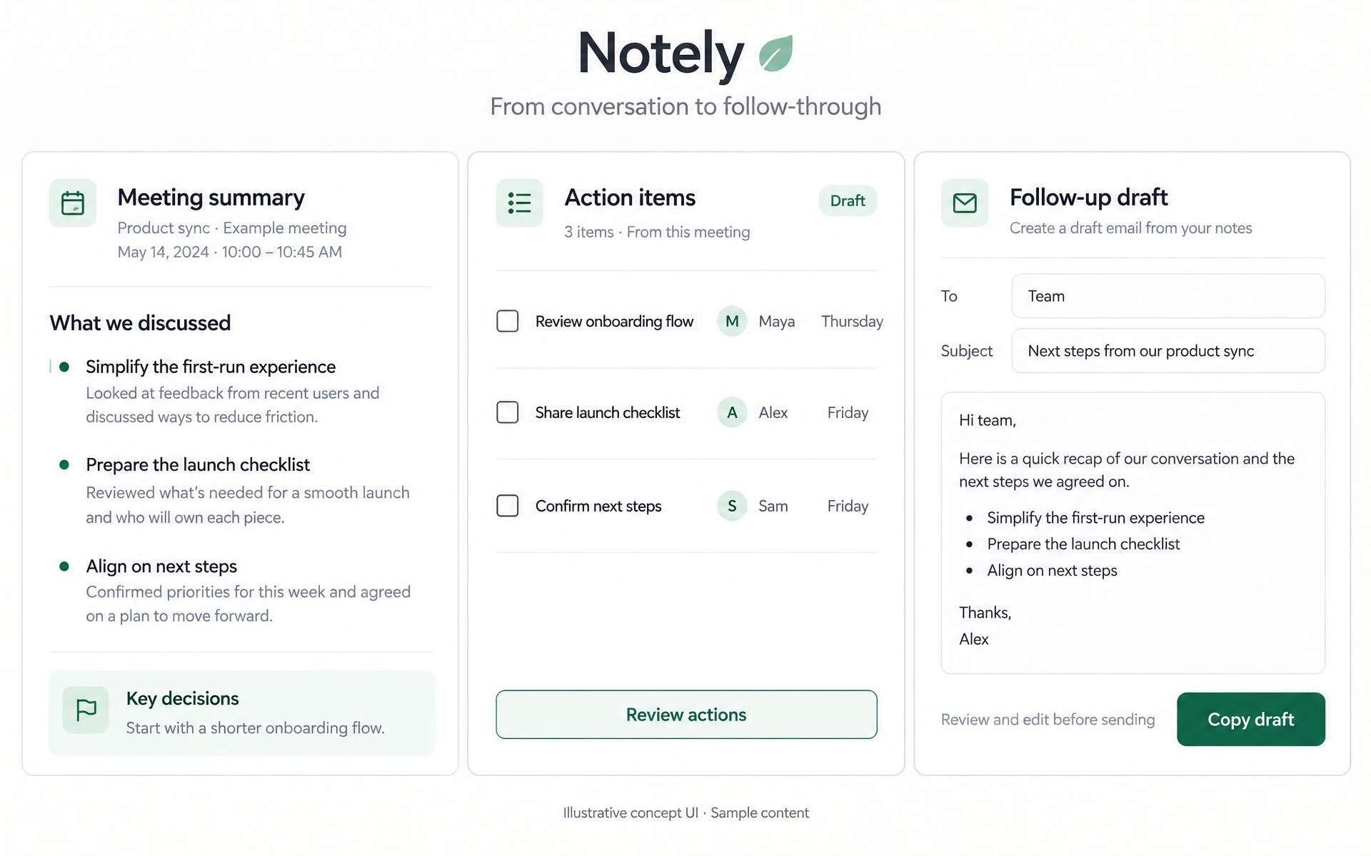
Show what comes out of the meeting.
Rather than describe an invisible AI process, the feature blocks use product UI mockups: a meeting summary, clear action items and a follow-up email draft. A three-step explanation connects the conversation to those useful outputs.
- Capture
- Clarify
- Follow through
These are fictional interface previews, not a connected product or a claim about AI accuracy, integrations or automated delivery.
04 — Visual direction & mobile
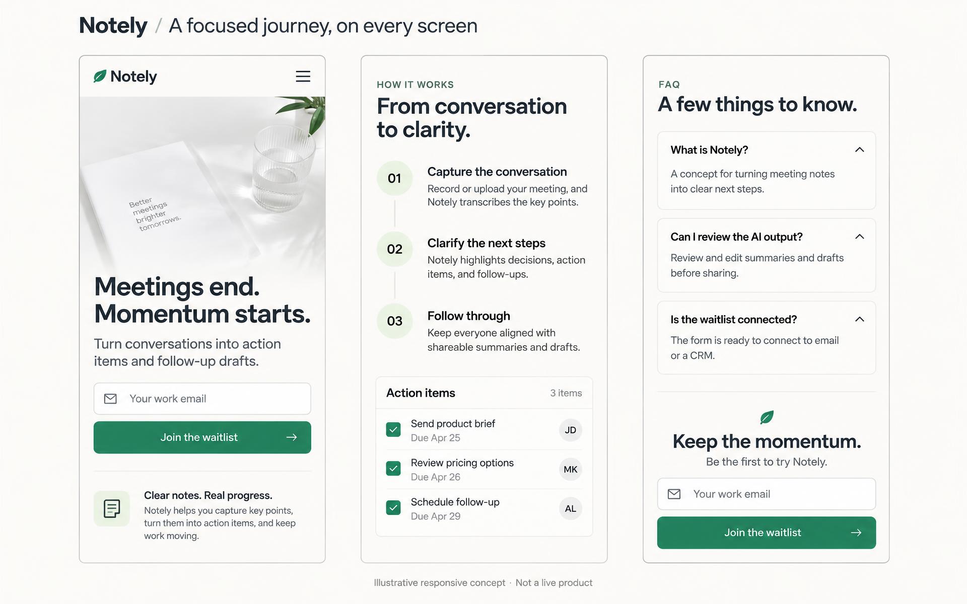
An engaging background. A readable promise.
The hero uses a custom AI-generated background, refined in Framer with a light overlay so the headline remains readable on mobile. The imagery supports the message instead of competing with the email capture.
The responsive page preserves the same hierarchy: promise, signup, explanation, feature detail and reassurance. The FAQ and closing CTA complete the journey without relying on fabricated social proof.
05 — Delivered & next steps
A landing page, not a claim of product traction.
Delivered
A responsive Framer site, SEO basics and a waitlist form ready to connect to email or a CRM.
Not claimed
A functioning AI meeting tool, connected waitlist delivery, customer testimonials, signup totals or conversion improvements.
Next validation
Connect the waitlist destination, test whether founders and team leads understand the promise, then evaluate the signup journey with real visitors.
Next case
PiAcademy
Have an idea
worth making real?
Tell us what you’re building. Let’s find the right next step.