PiAcademy: Rebuilding a UK exam-prep platform for scale.
Rebuilding a UK exam-prep platform for scale.
- Category
- Product Design · UX Strategy
- Industry
- EdTech · UK exam preparation
- Design scope
- UX Strategy · UI · Design System
- Year
- 2024–2025
- Timeline
Phase 1: December 2024 – April 2025
- Team
- Founder, PM, 3 Developers, Tutors
- Platforms
- Website · Mobile Web · Student Dashboard · Admin
An EdTech platform helping parents prepare children for 7+ to 11+, GCSEs, SATs, and competitive UK school entrance exams.
Design by Koshal Sharma as the sole product designer during employment, in collaboration with the in-house team. Presented as Artmaa’s founder experience, not an Artmaa agency commission.
01 — The challenge
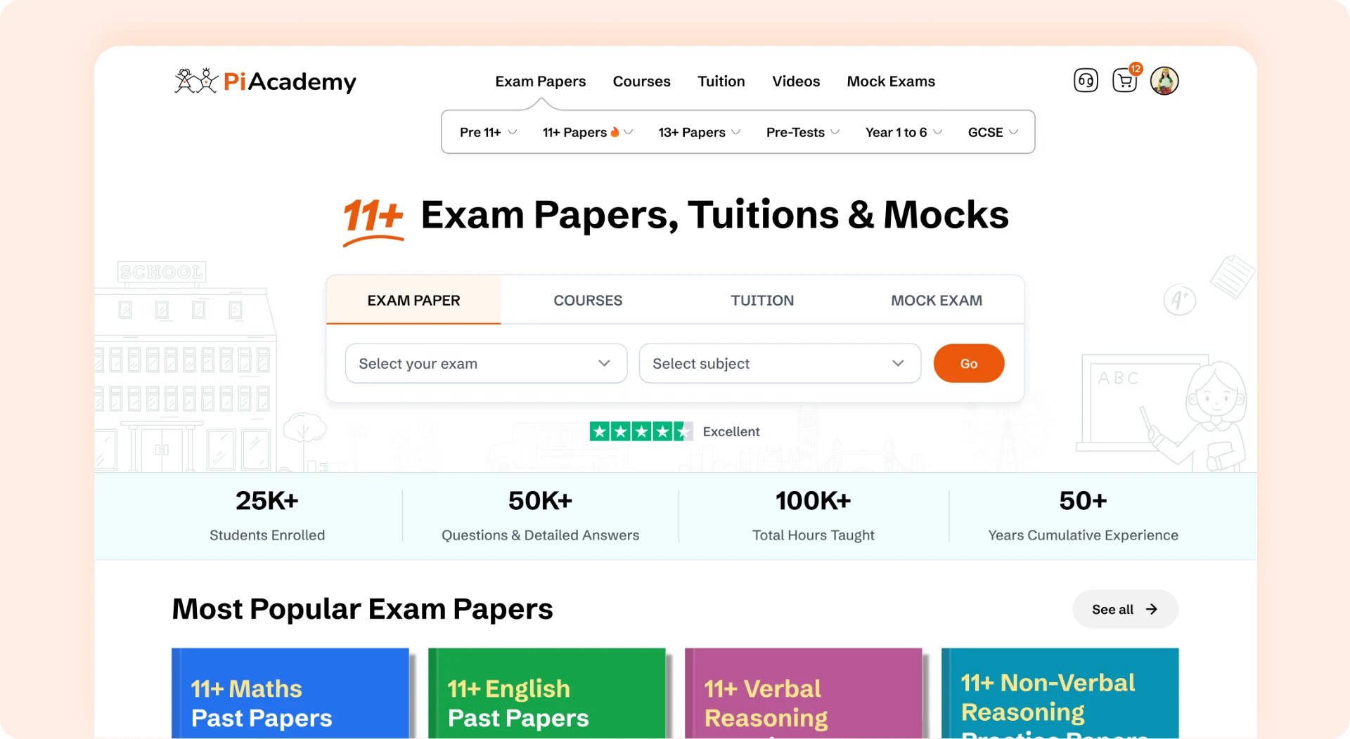
The product had grown faster than its experience.
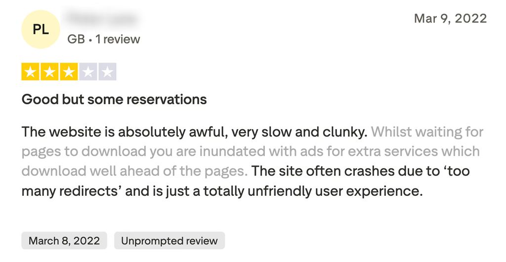
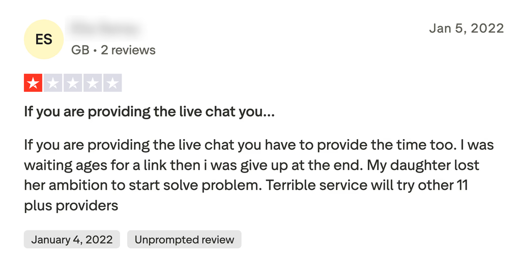
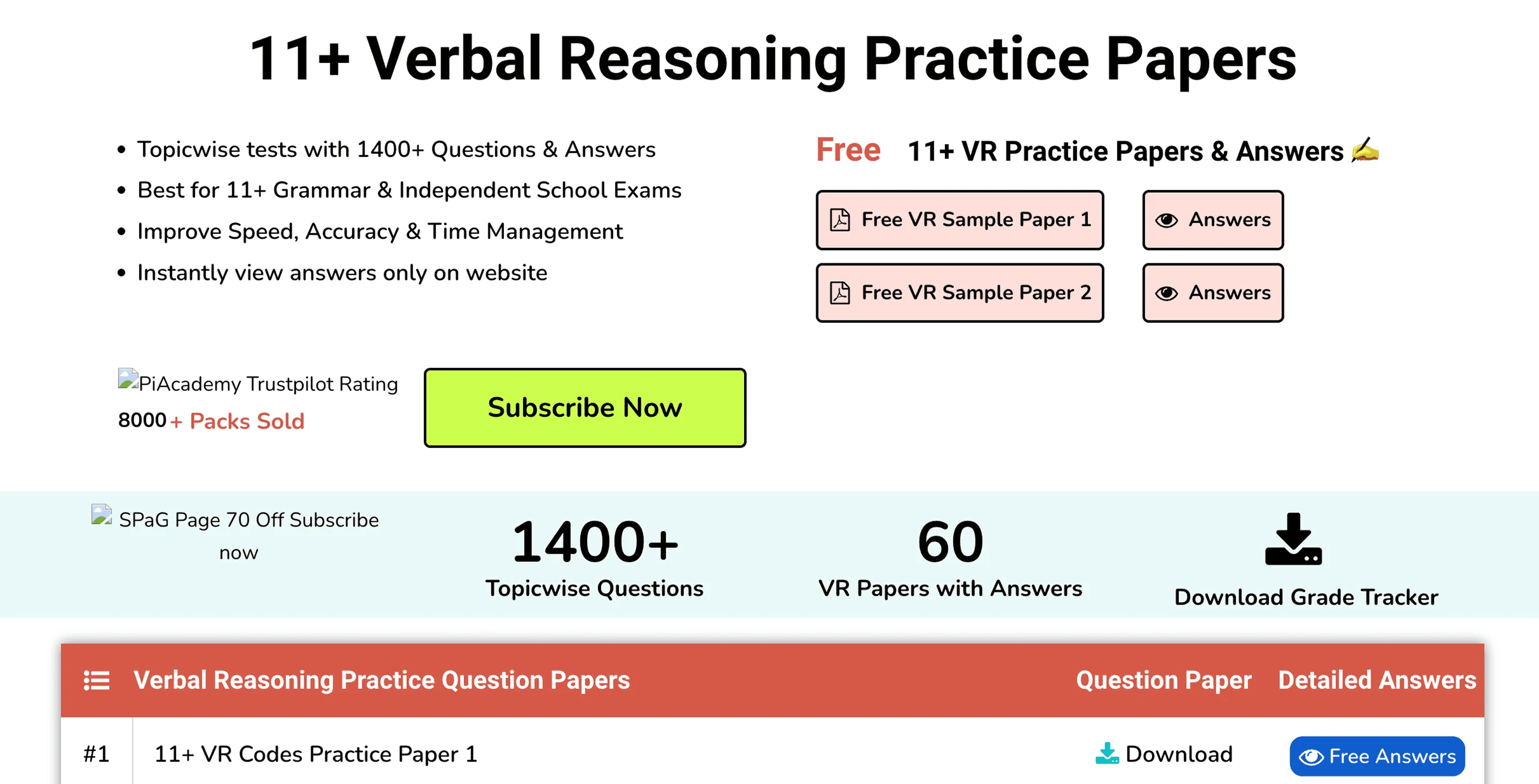
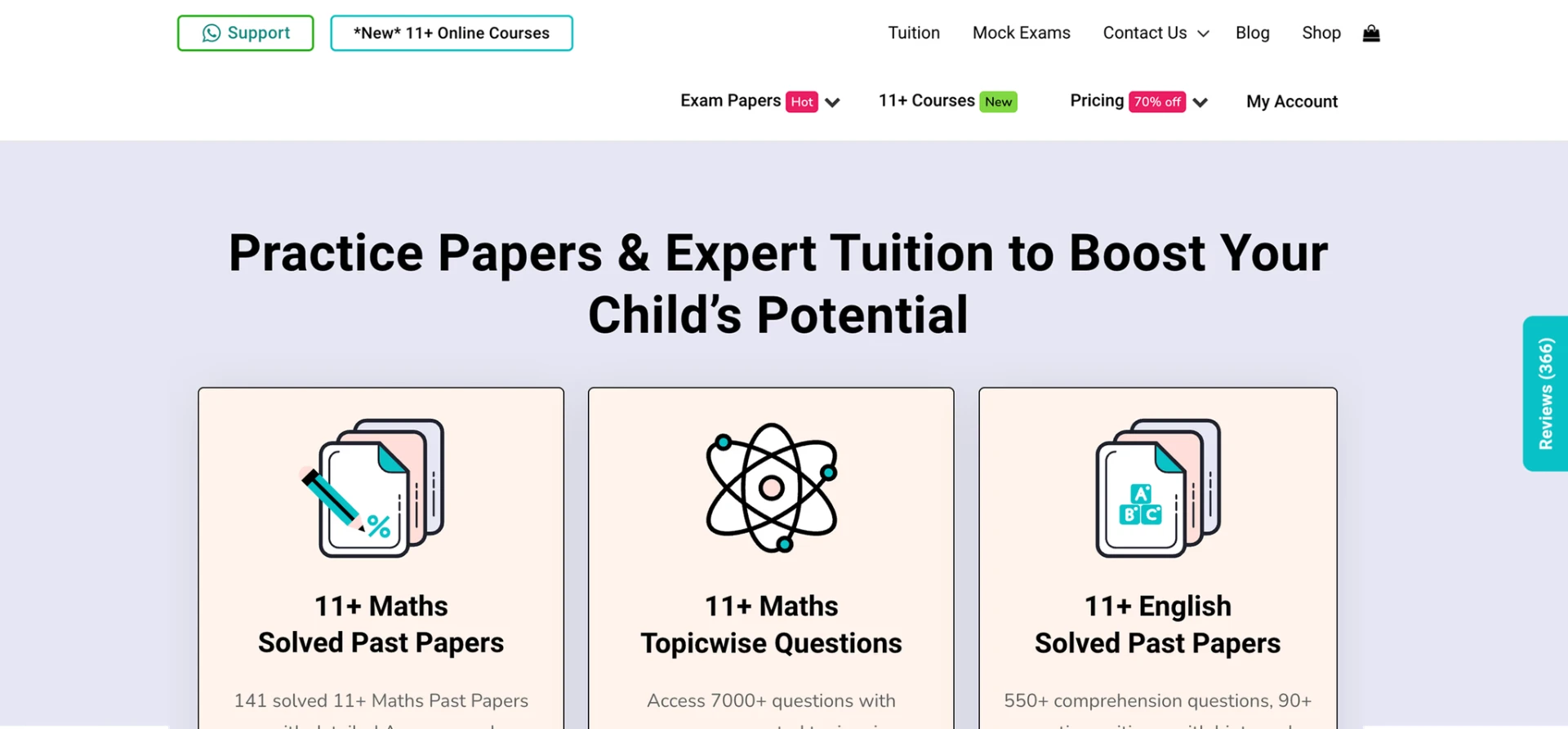
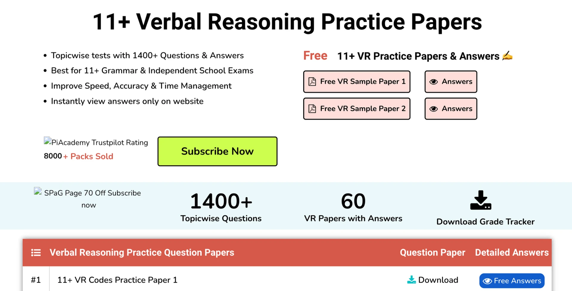
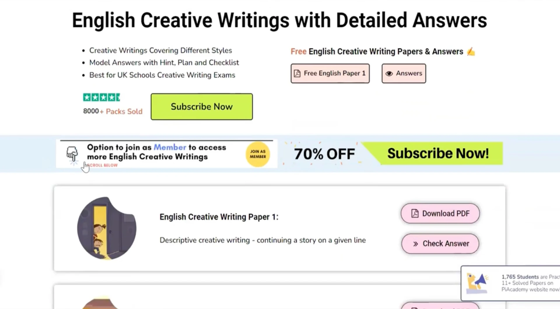
No shared component library. New products meant new layouts. Users hit friction on the path to purchase. Google Reviews, support feedback, and heatmaps told the same story.
With exam season approaching, the experience needed to become clearer without disrupting a live business.
Make the journey from discovery to purchase clearer and easier for parents — while building a scalable foundation for the growing product.
02 — Product ecosystem
The same learning content is used by four types of users.
- Purchase
- Practice
- Teach
- Manage
Parent / Buyer
Finds the right exam preparation and makes the purchase.
Student / Learner
Practices, takes mock exams, and completes courses.
Tutor / Buyer & distributor
Buys content, teaches with it, and assigns work to students.
School / Institutional user
Uses the platform to manage learning for multiple students.
Same content. Different needs.
03 — Scope & collaboration
End-to-end product design. A live business throughout.
Design scope
UX strategy, information architecture, wireframes, UI and a new design system. Early collaboration with the CTO and founding developer checked technical fit; handoff and QA connected design to the in-house team, founder and PM.
Outside design scope
Content and papers, pricing, backend and schema remained with the product team.
04 — Understanding the problem
The answers were already in the product.
Reviews and session data pointed to the same three things.
Cluttered
Too much on screen, no clear priority.
Inconsistent
Different patterns across the product.
Checkout friction
Confidence dropped at the point of purchase.
The problem shifted from redesigning pages to making the journey feel trustworthy.
05 — Information architecture
A growing catalogue needed a clearer structure.
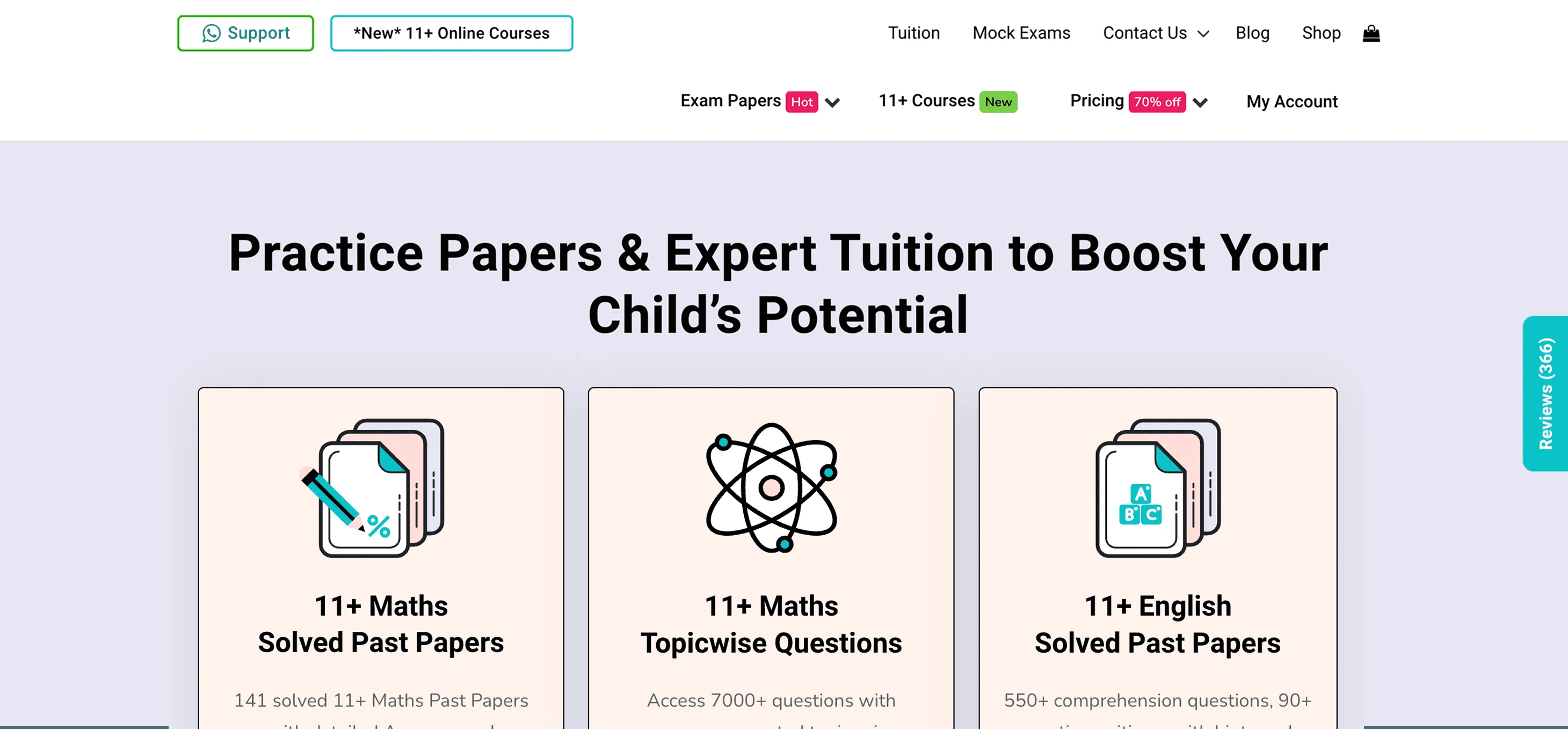
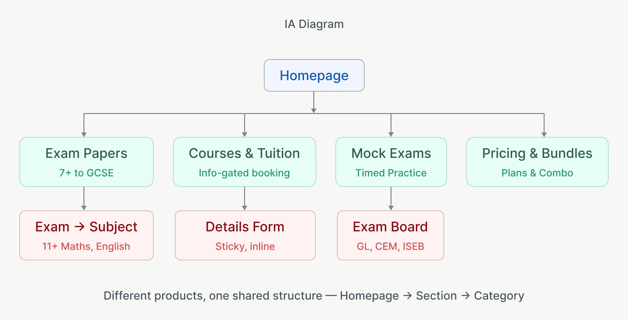
PiAcademy spans 7+ to 13+, GCSEs, exam papers, courses, mocks, tuition and video learning.
Homepage navigation was organised around Exam Papers, Courses & Tuition, Mock Exams, and Pricing & Bundles. The audit revealed three levels: Product → Exam → Subject. Similar patterns repeated across exam categories.
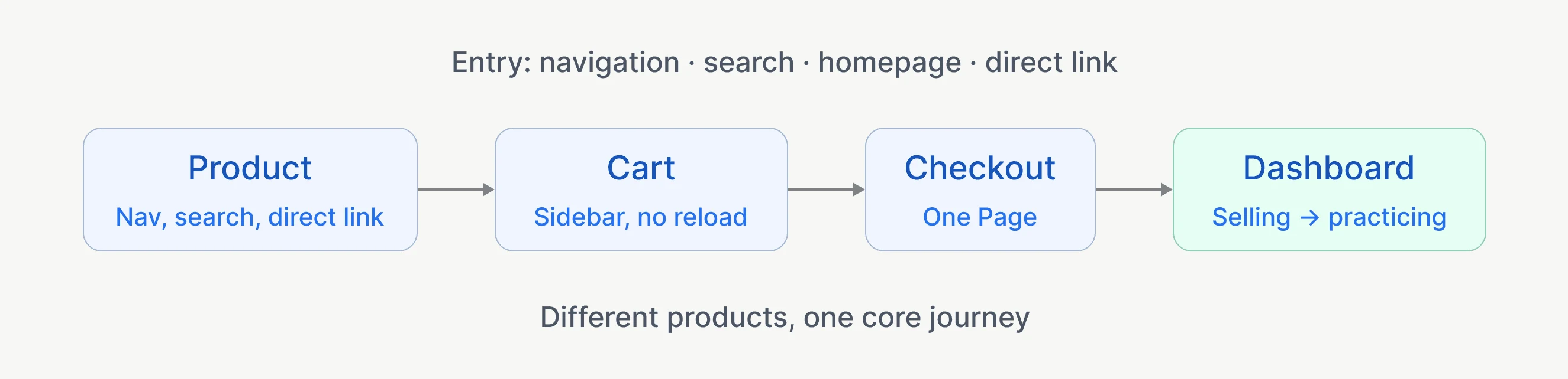
Users could enter through navigation, search, homepage content, or direct product links — but different products ultimately converged on the same flow.
- Product
- Cart
- Checkout
- Dashboard
Different products, one core journey.
This became the foundation for a scalable design system and a more consistent experience.

06 — Exploration & purchase
The problem wasn’t one page. It was the journey between them.
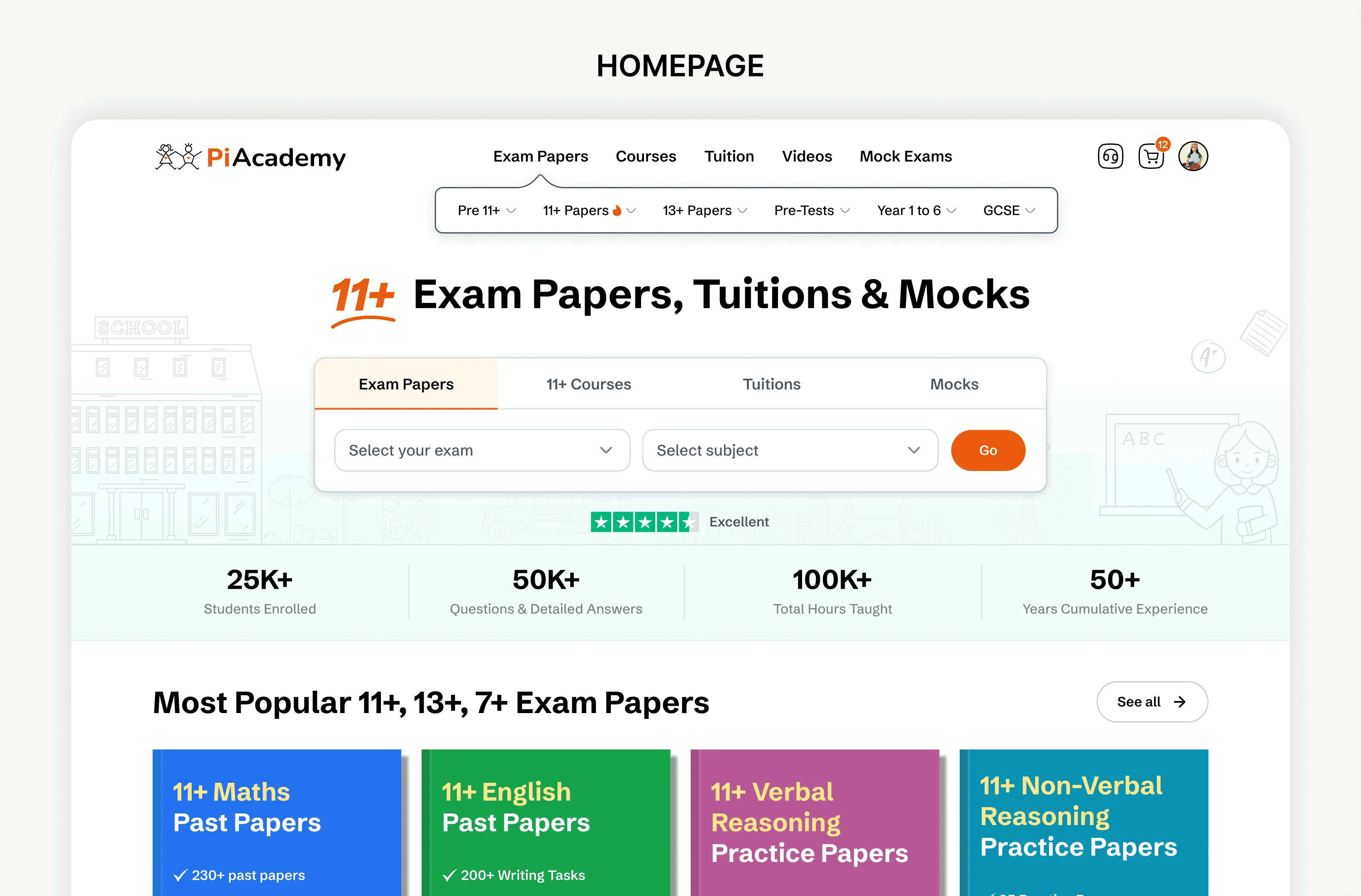
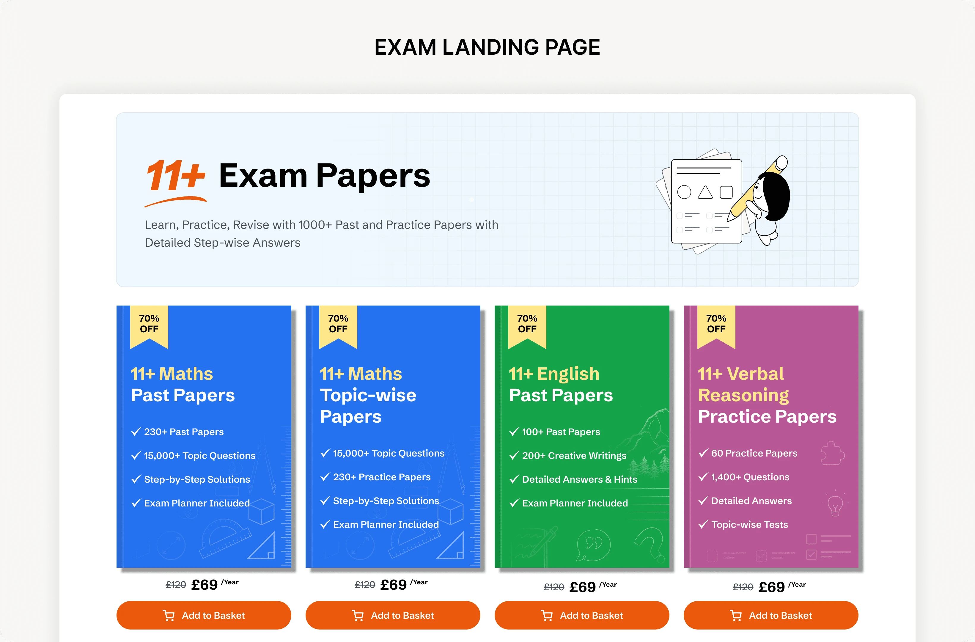
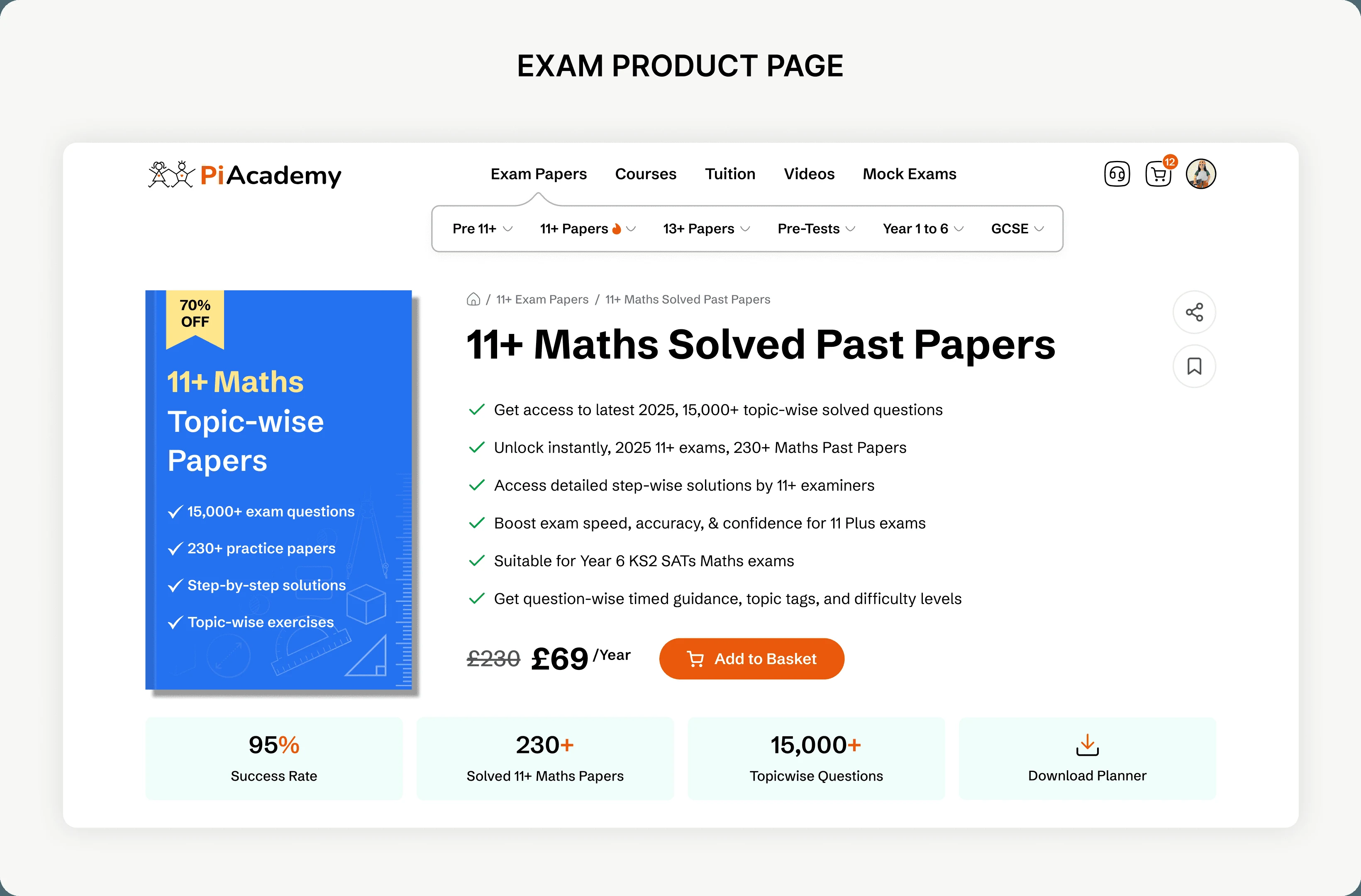
The redesigned navigation brings best-selling papers into view, keeps 11+ Maths and English one click away, and scopes search to the selected paper. Product pages follow one hierarchy: what it is, who it’s for, what’s included and price, with a consistent purchase action.
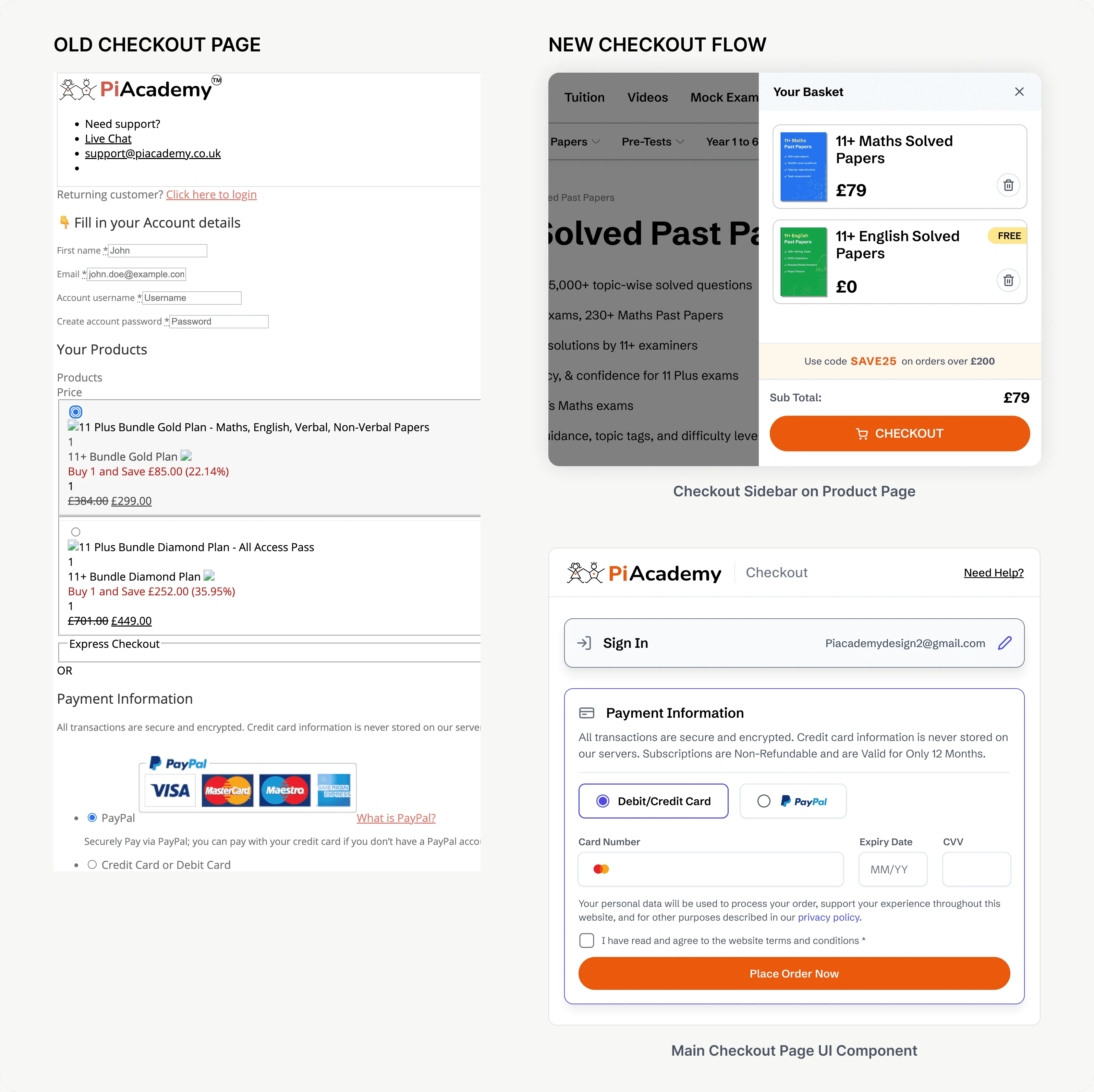
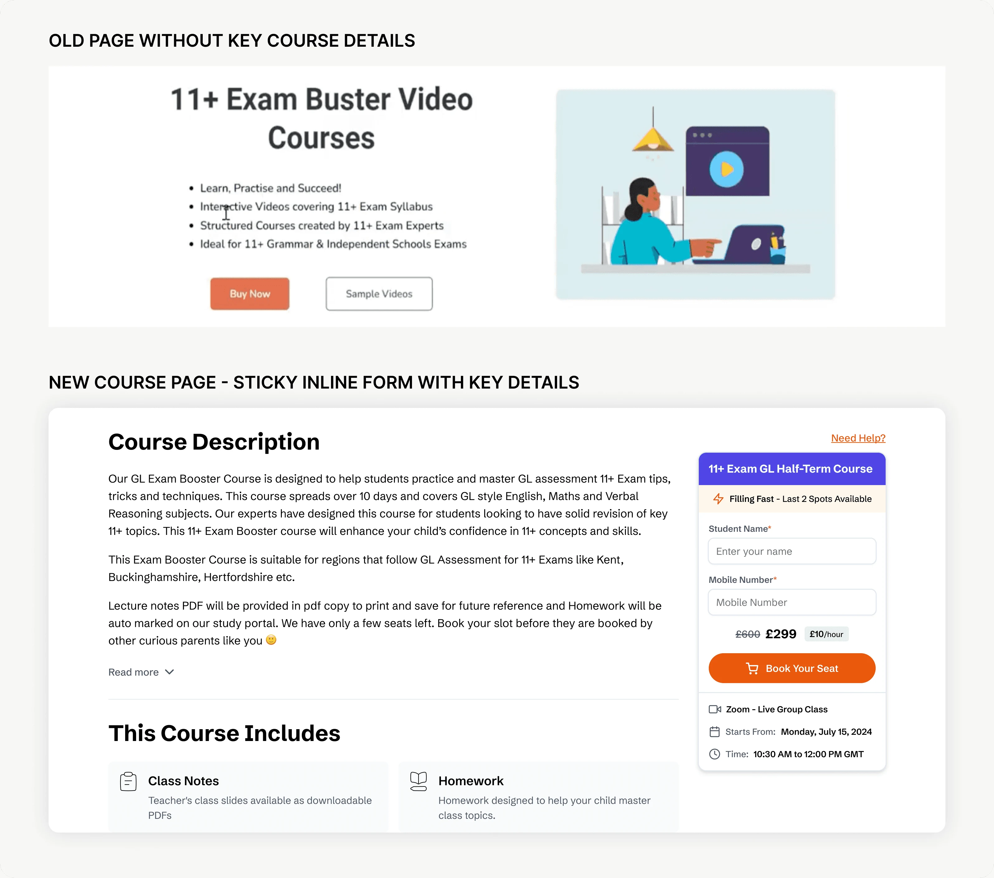
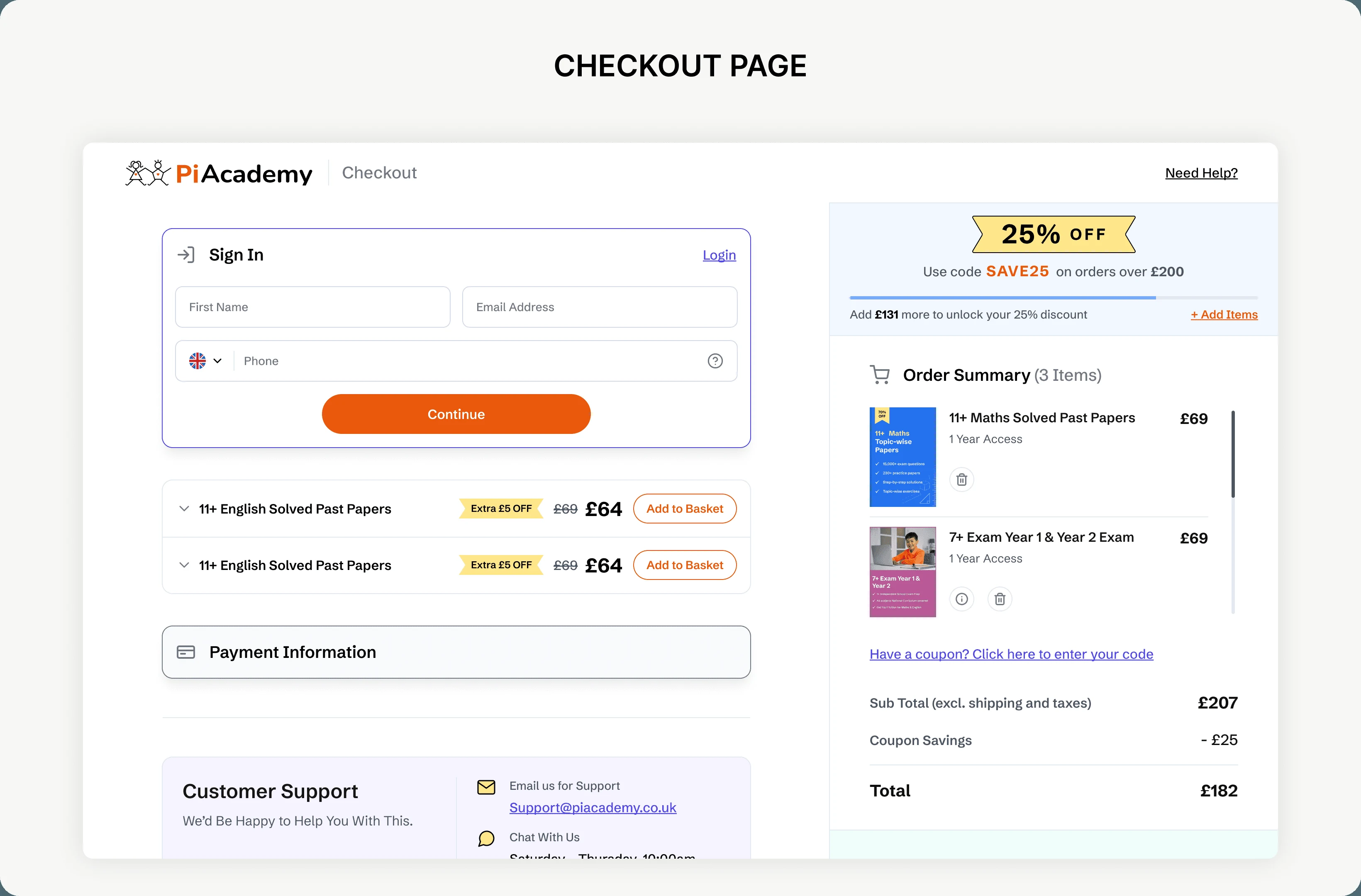
Papers go straight to a single-page checkout. Courses, tuition and mocks add an inline student-details form that stays sticky as the parent scrolls — never a separate page that breaks the read mid-decision.
- Find
- Decide
- Buy
- Dashboard
Make it easy to find. Make the decision clear. Keep the purchase predictable.
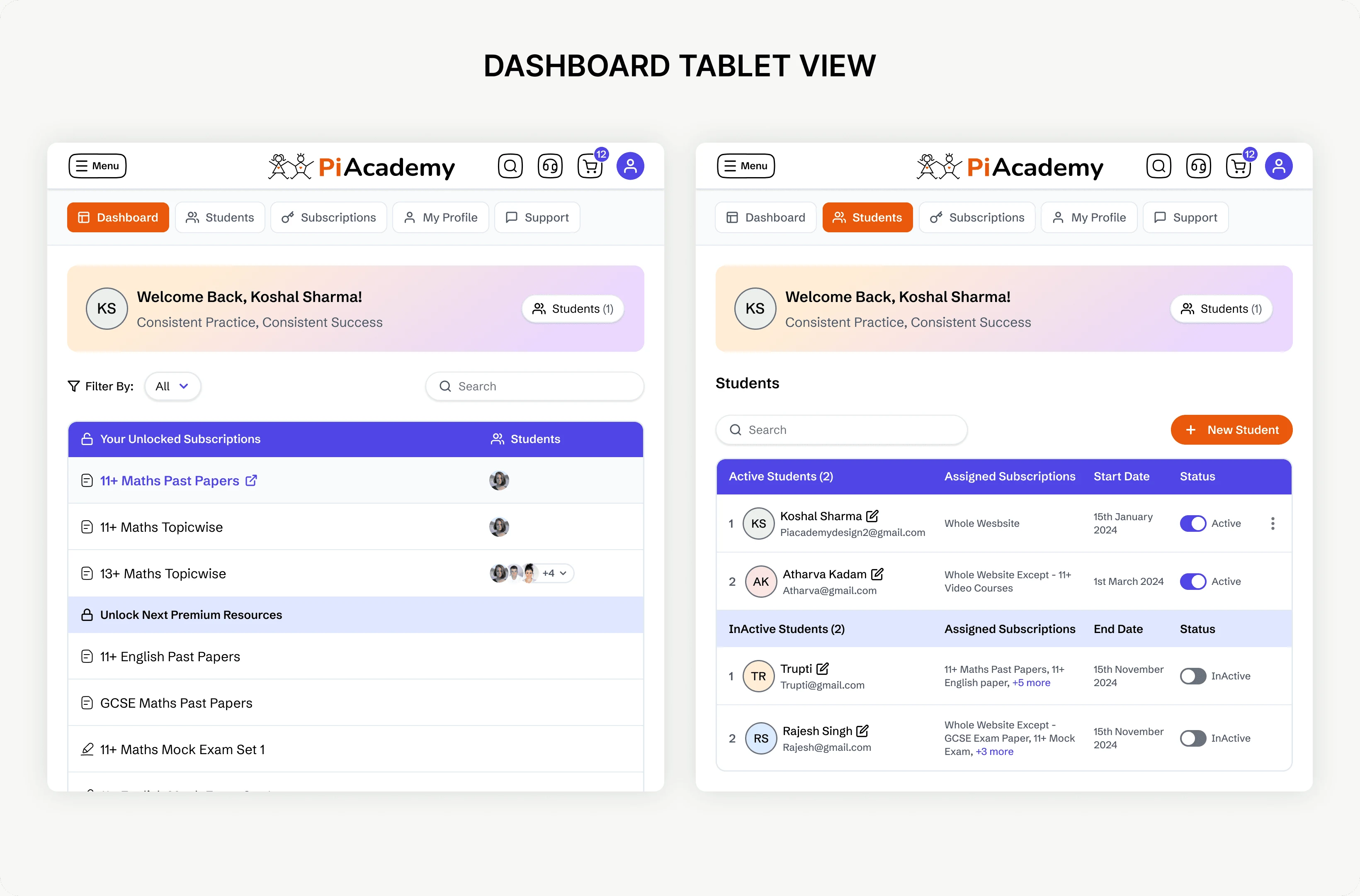
Payment confirmed: a confirmation email is sent, and the parent is redirected to the student dashboard, where the child can start practicing.
07 — Key design decisions
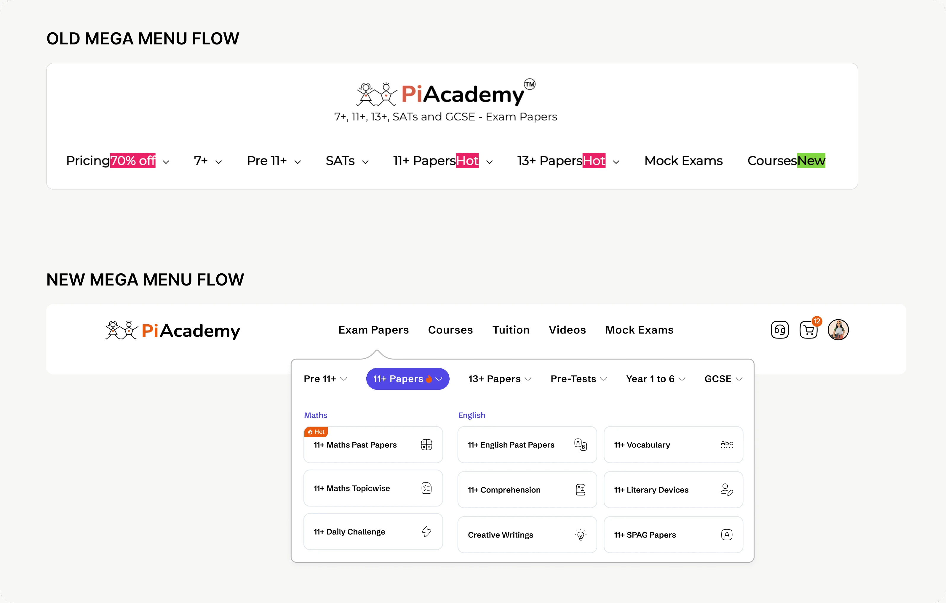
01 / Open the menu, don’t nest it
Best-sellers were easy to miss. The navigation was rebuilt so opening ‘Exam Papers’ visibly reveals its contents.
Trade-off: A longer, busier menu — less room to add new categories without it feeling crowded.
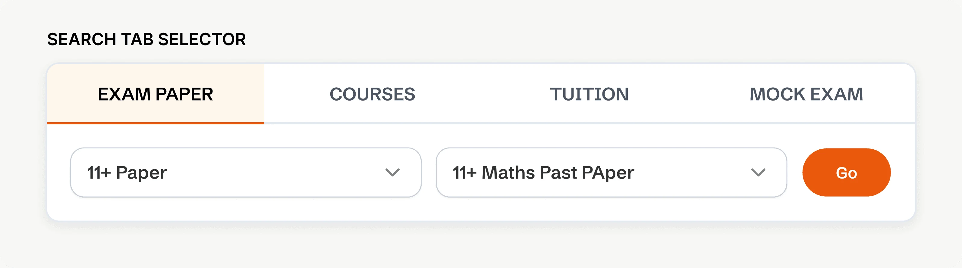
02 / Search, alongside browse — scoped, not global
Exam papers get a precise path — pick a category, pick the exact paper, land there directly. Courses, video courses, and mock exams route to a general page instead — a shortcut, not a search.
Trade-off: Wanted this for every product. Dev capacity and timeline meant it only shipped for papers.
03 / One layout, every product page
CTAs shifted page to page, dense text buried the decision. One consistent order was established — what it is, who it’s for, what’s included, price — CTA fixed in place.
Trade-off: Less flexibility for products that didn’t fit the pattern — courses needed information papers didn’t.
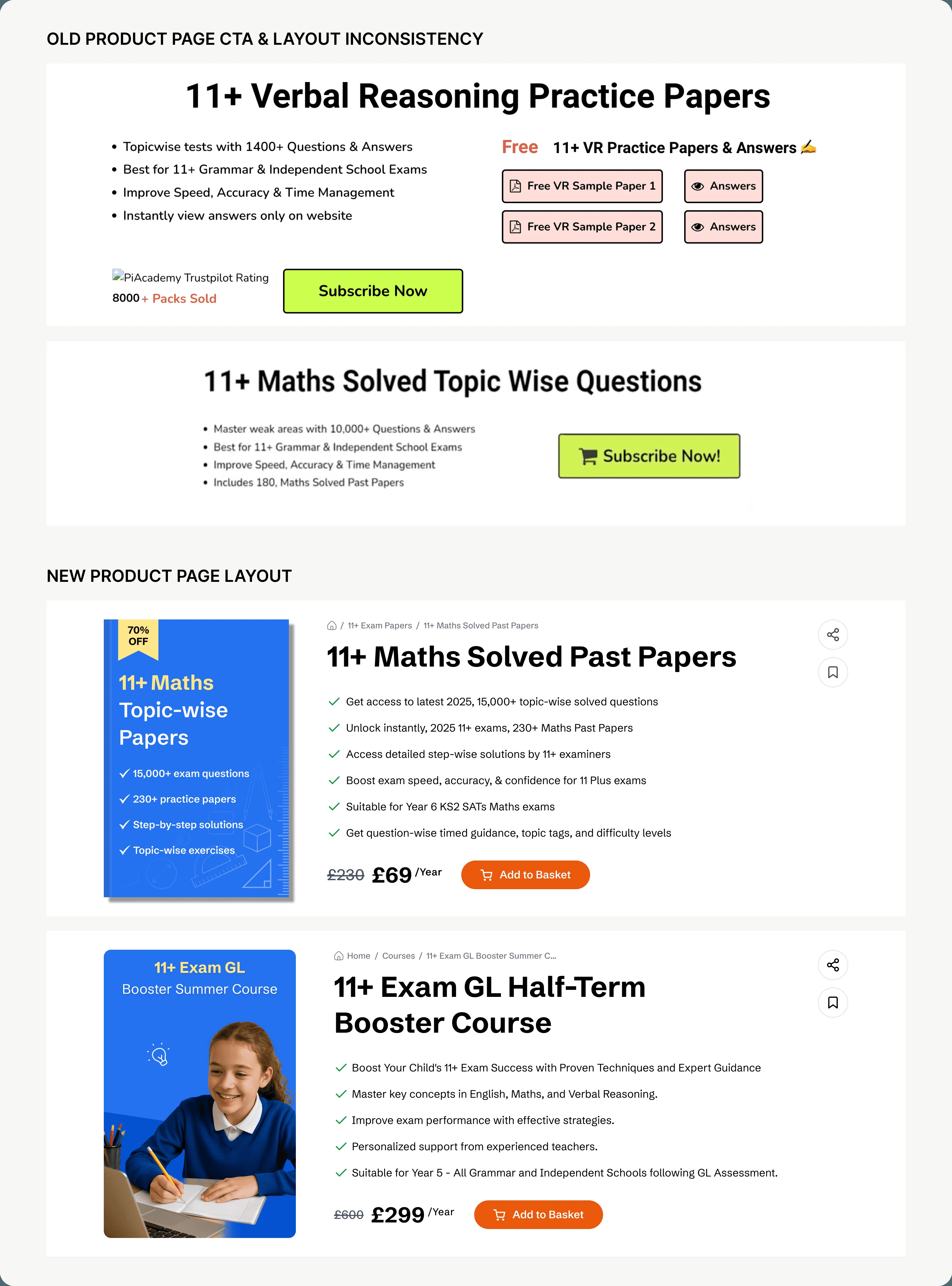
04 / One clear purchase, not a competing choice
Two equal-weight cards made the free item look like a choice. The element was removed and later reintegrated — smaller, secondary — in checkout and the sidebar.
Trade-off: Removing it simplified checkout, but lost the visibility of a real benefit. Bringing it back, smaller, was the balance.
05 / Course details, on the page — not buried in email
Course access lived only in email. Moved onto the page — countdown before it starts, Zoom link and progress once it’s underway. Parents find course details on the page — support no longer has to look them up.
08 — Final experience
Selected screens, in context.
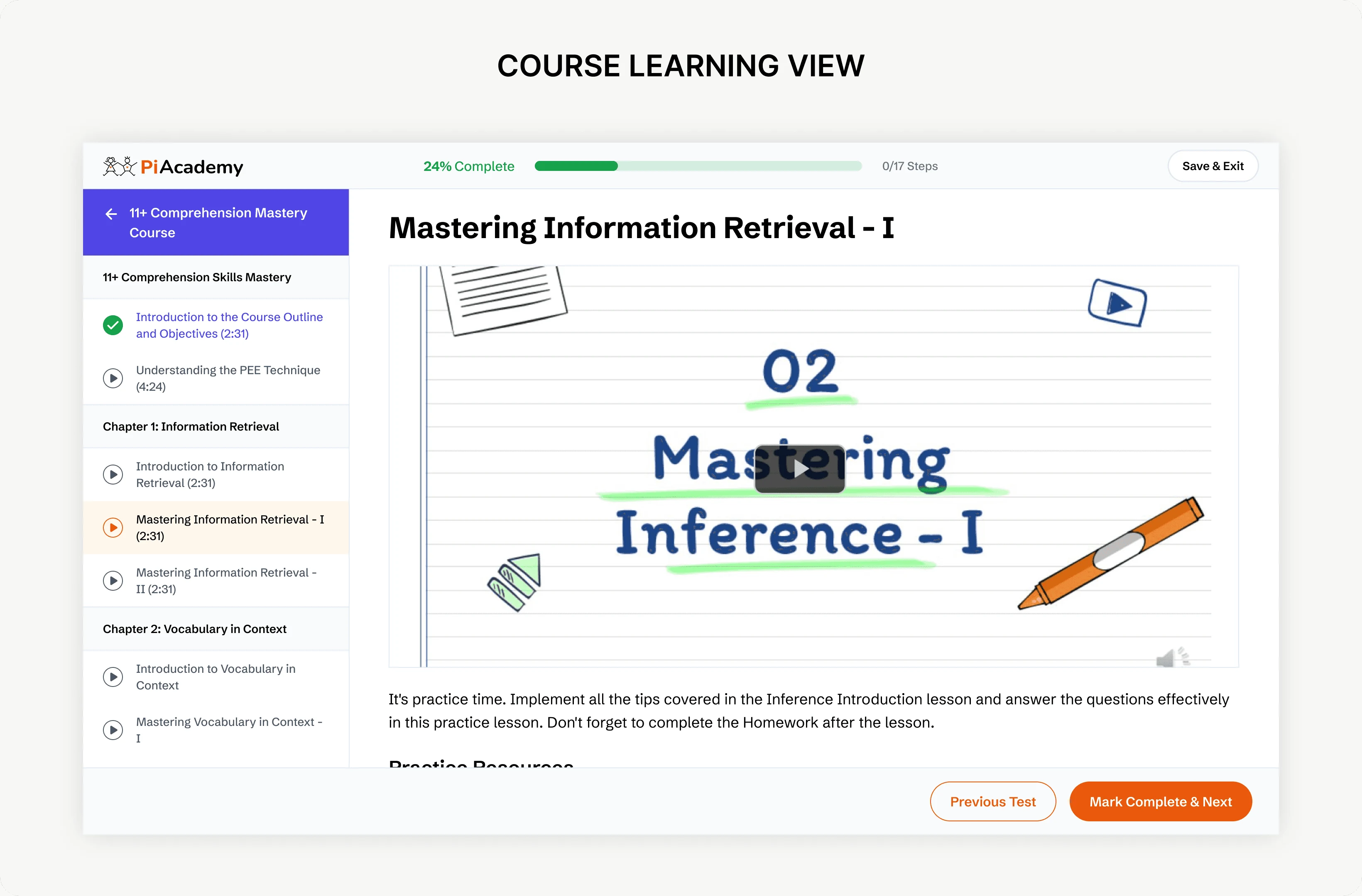
From discovery to practice — a consistent experience across the catalogue, purchase and learning.
09 — Impact
Qualitative
Parents and students adapted quickly. The founder heard it directly — families praising the new structure, calling it easier to use. Developers confirmed faster build time, since new products now reuse the shared system instead of starting fresh, and better page performance, replacing a site that was often broken and inconsistent. Current data shows the majority of visitors are returning, not new — a sign the experience holds up under real, repeated use.
10 — Learning & next priorities
The parent buys. The child uses it. Designing for both was the real challenge.
A shared journey matters more than a collection of redesigned pages. Where that journey breaks, parents turn to support.
Delivery required clear trade-offs: search launched for papers first, and the navigation still needs room to grow. Earlier direct user research and closer QA collaboration would strengthen the next iteration.
Recurring dead clicks and a dominant error remain priorities for further investigation — the redesign is a foundation, not a claim that every problem is solved.
The design system and Phase 2 AI work continue in PiAcademy / Scale.
Next case
School Uni Guide
Have an idea
worth making real?
Tell us what you’re building. Let’s find the right next step.