School Uni Guide: Designing a connected UK education discovery platform from 0→1.
Designing a connected UK education discovery platform from 0→1.
- Category
- Product Design · UX Strategy
- Industry
- EdTech · UK education discovery
- Design scope
- UX Strategy · UI · Design System
- Year
- 2023–2024
- Timeline
September 2023 – April 2024
- Team
- Founder · PM · Developers
- Platforms
- Responsive Web · Mobile
Helping parents and students search, get advice and compare schools, universities, courses and exam-preparation resources — with a foundation that grew into a connected education ecosystem.
Design by Koshal Sharma as the sole product designer during employment, in collaboration with the in-house team. Presented as Artmaa’s founder experience, not an Artmaa agency commission.
01 — The challenge
The information existed. It just wasn’t connected.
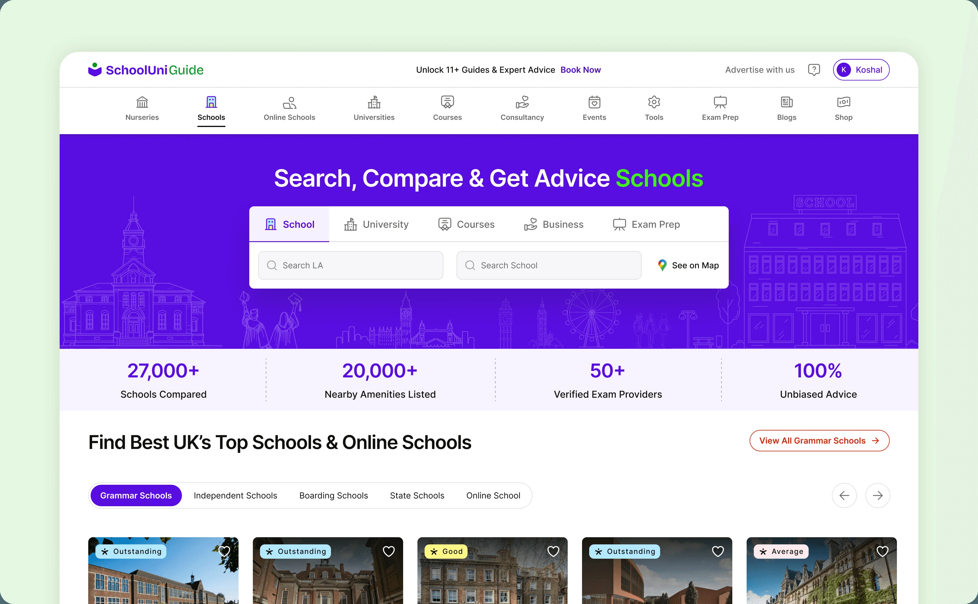
Parents pieced together school data, catchment areas, locations, exam requirements and parent discussions just to evaluate one school. The founder experienced this while choosing a school for her daughter; parent conversations and forums revealed the same pattern.
The opportunity was not another directory. It was one clear path to discover, locate, evaluate, compare and act.
Which schools are relevant to my child — and how do I decide between them?
02 — Scope & research
From product definition to design delivery.
The design scope connected UX strategy, information architecture, wireframes, UI, a new design system, developer handoff and QA. School-data sourcing and backend catchment logic remained outside the design scope.
Research drew on the founder’s experience, parent forum and portal conversations, PiAcademy’s parent audience and competitive analysis. Close collaboration with the founder, PM and developers kept discovery, maps and comparison aligned with product constraints.
03 — Product ecosystem & architecture
Search. Get advice. Compare.
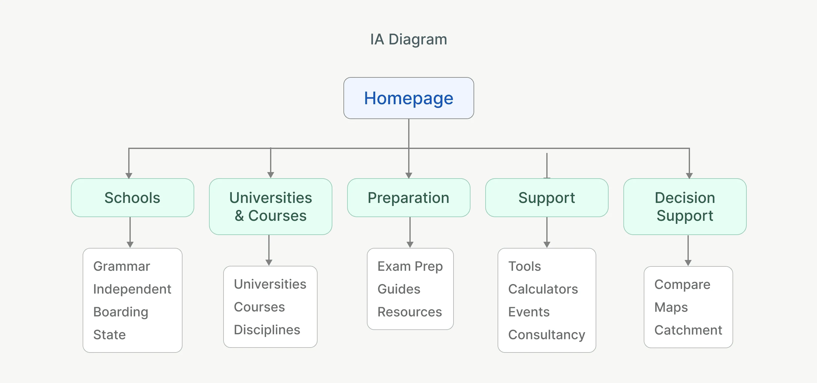
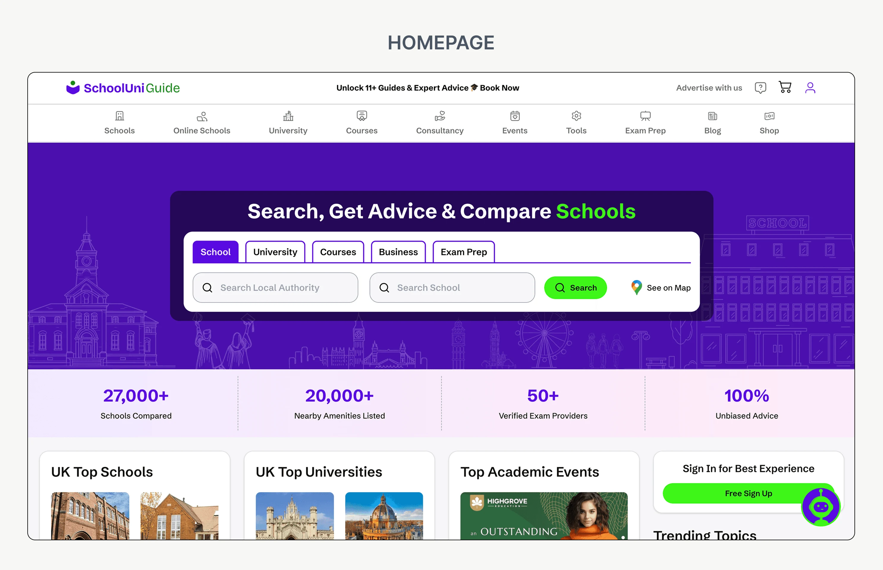
Parents discover and compare schools and exam-preparation resources. Students explore universities, courses and education opportunities. Schools get discovered, while tutors and education businesses reach relevant families.
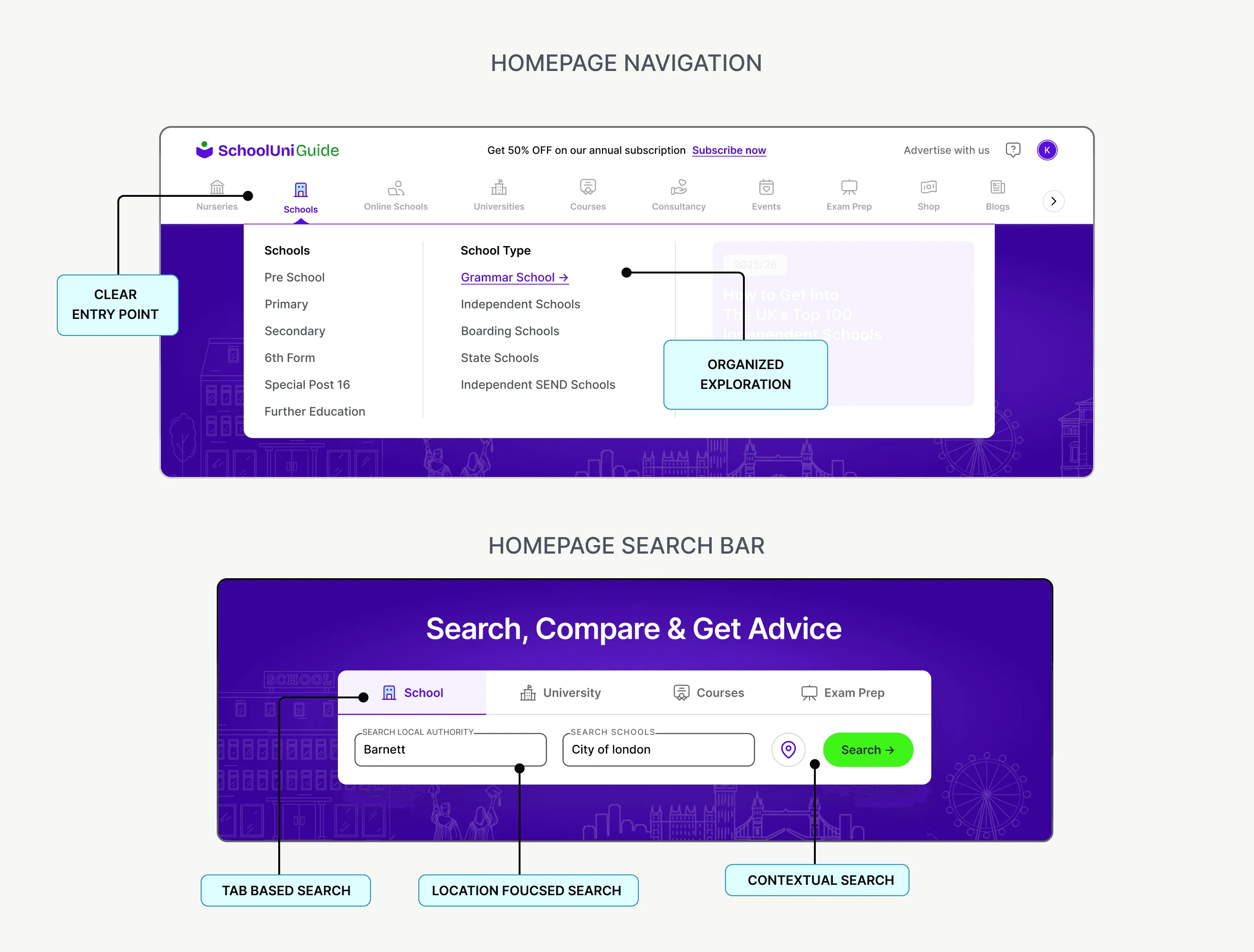
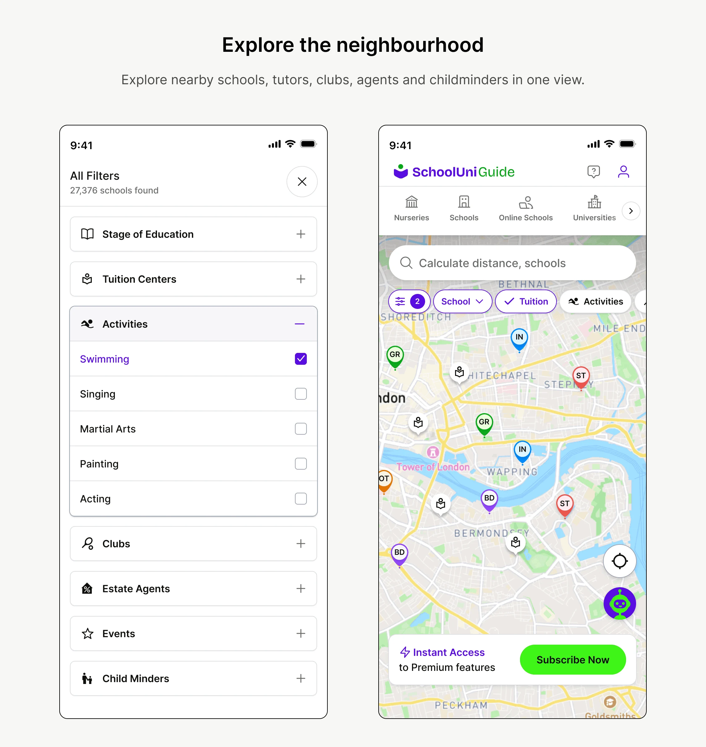
Three intents shaped the architecture: what am I looking for — schools, universities, courses or exam prep; what type — grammar, independent, boarding, state or SEND; and what helps me decide — catchment, maps, guides, calculators and comparison.
- Discover
- Locate
- Evaluate
- Compare
- Act
Keep the decision simple while allowing the product underneath it to grow.
04 — Exploration
The journey mattered more than any single screen.
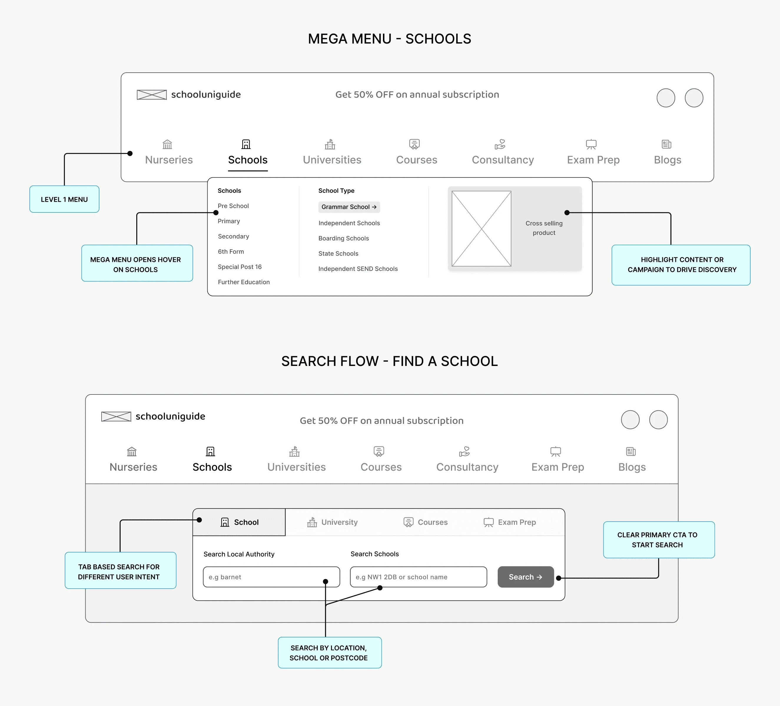
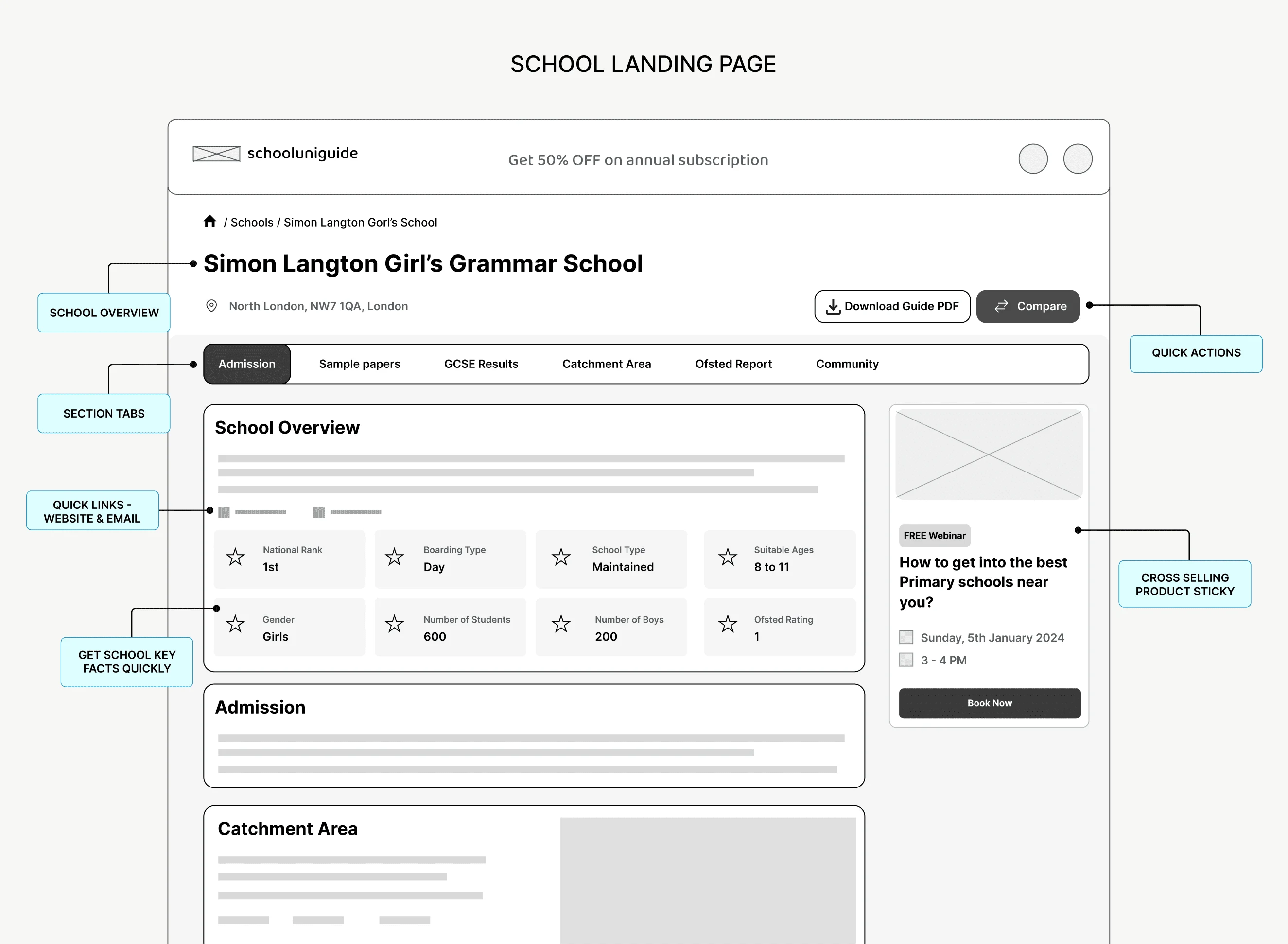
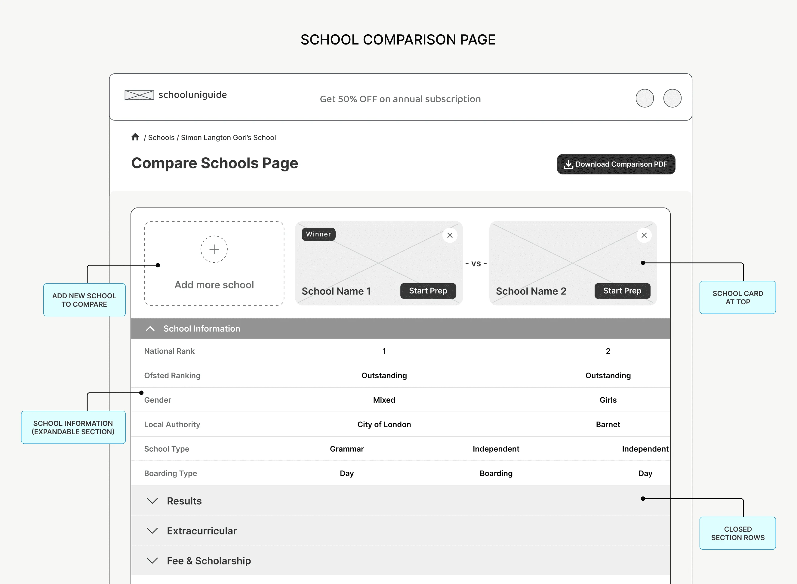
Wireframes connected education-stage and school-type entry points with focused listings, progressively disclosed school profiles and side-by-side comparison. Mega-menu and tabbed navigation shared one structure.
05 — Discovery & comparison
Turn a large catalogue into a manageable shortlist.
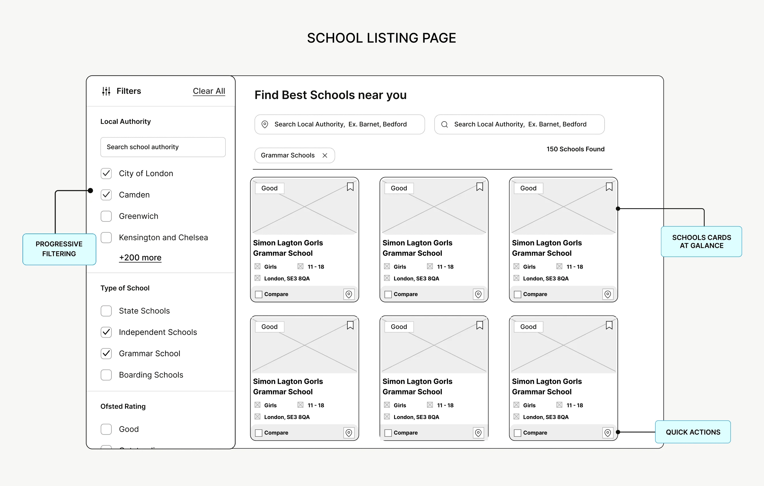
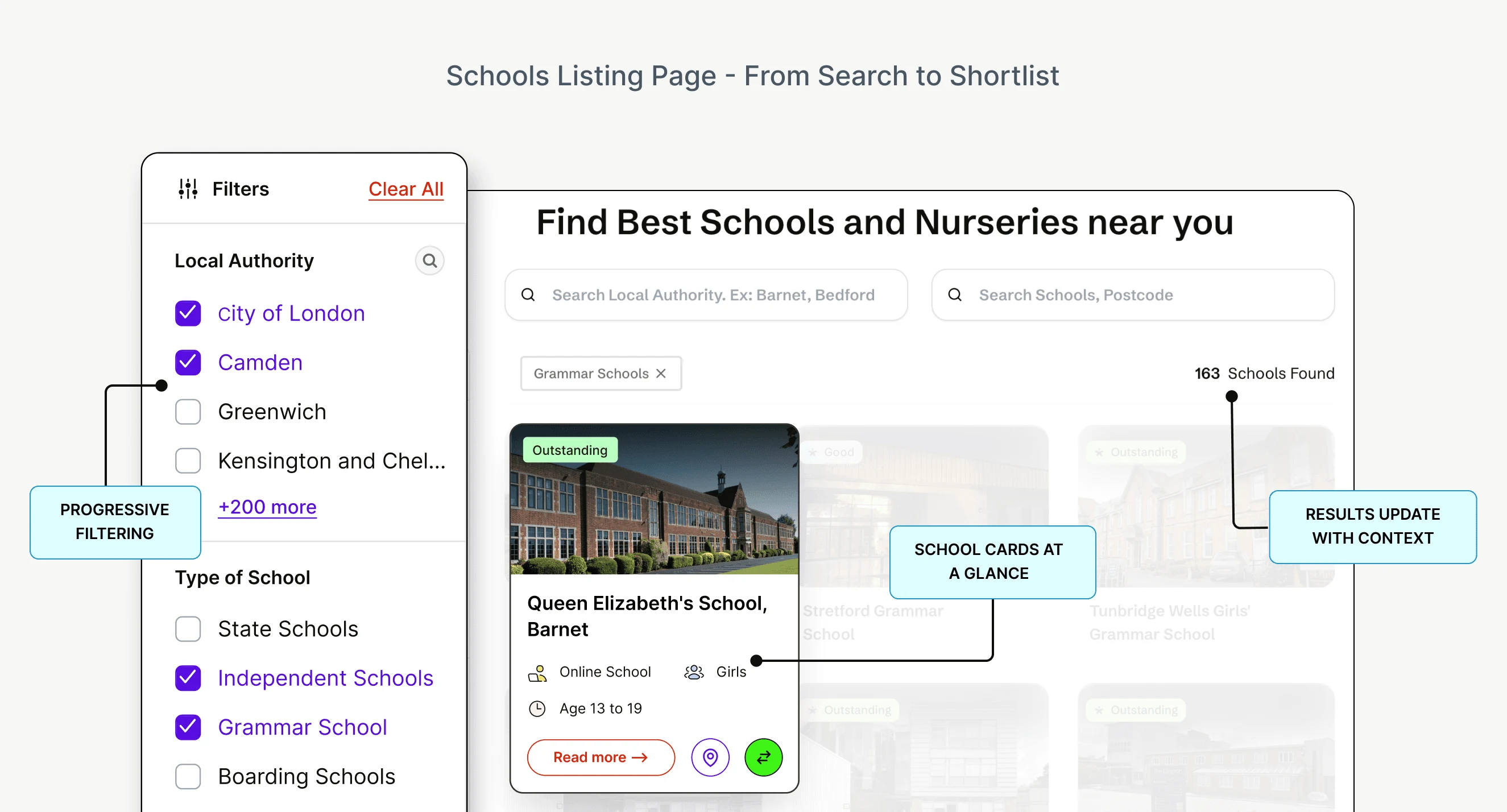
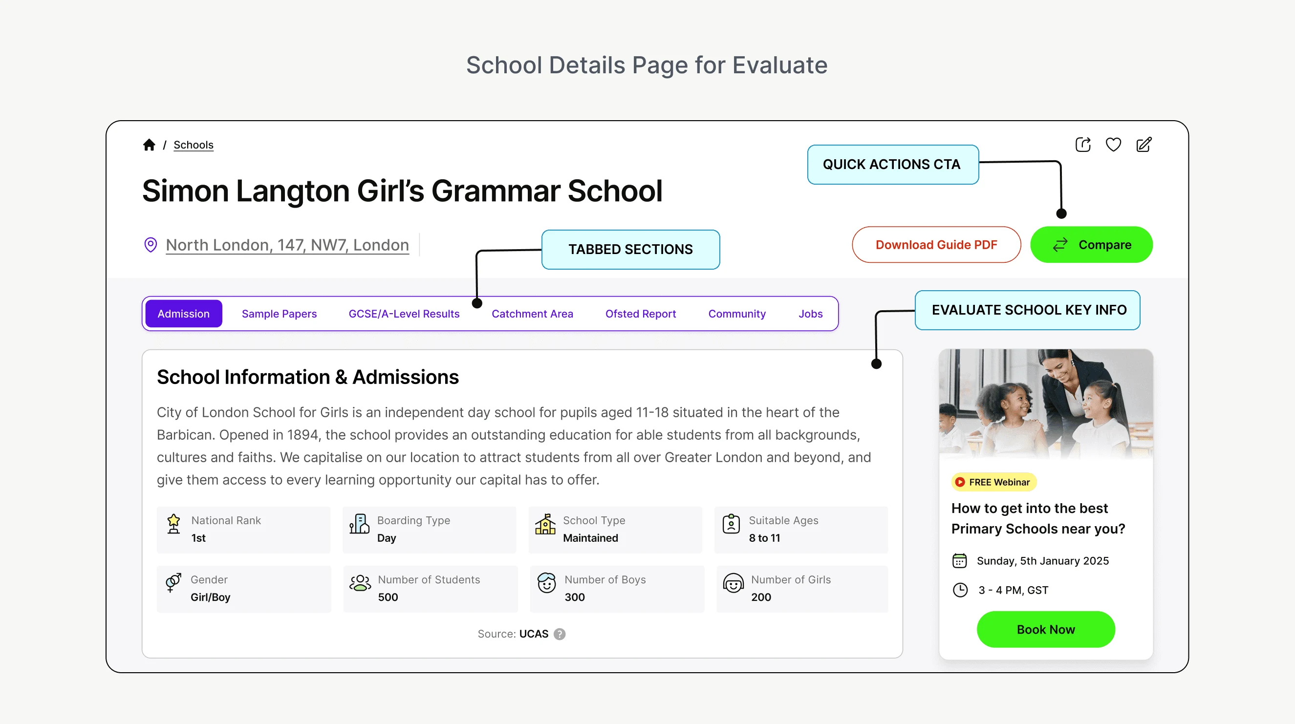
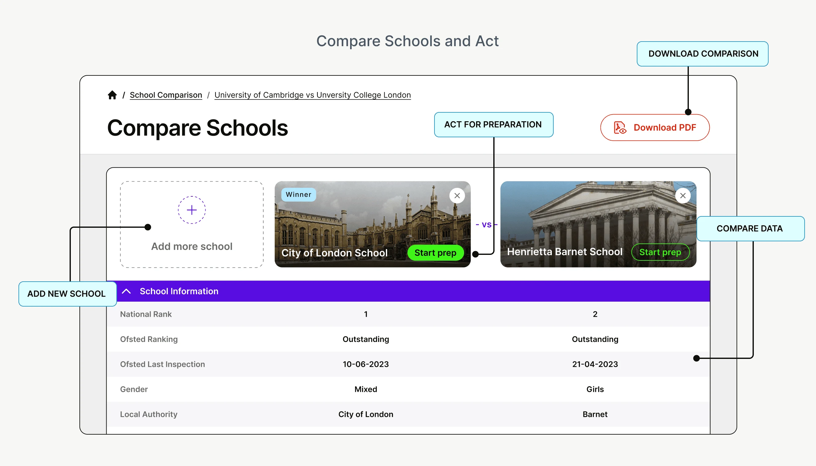
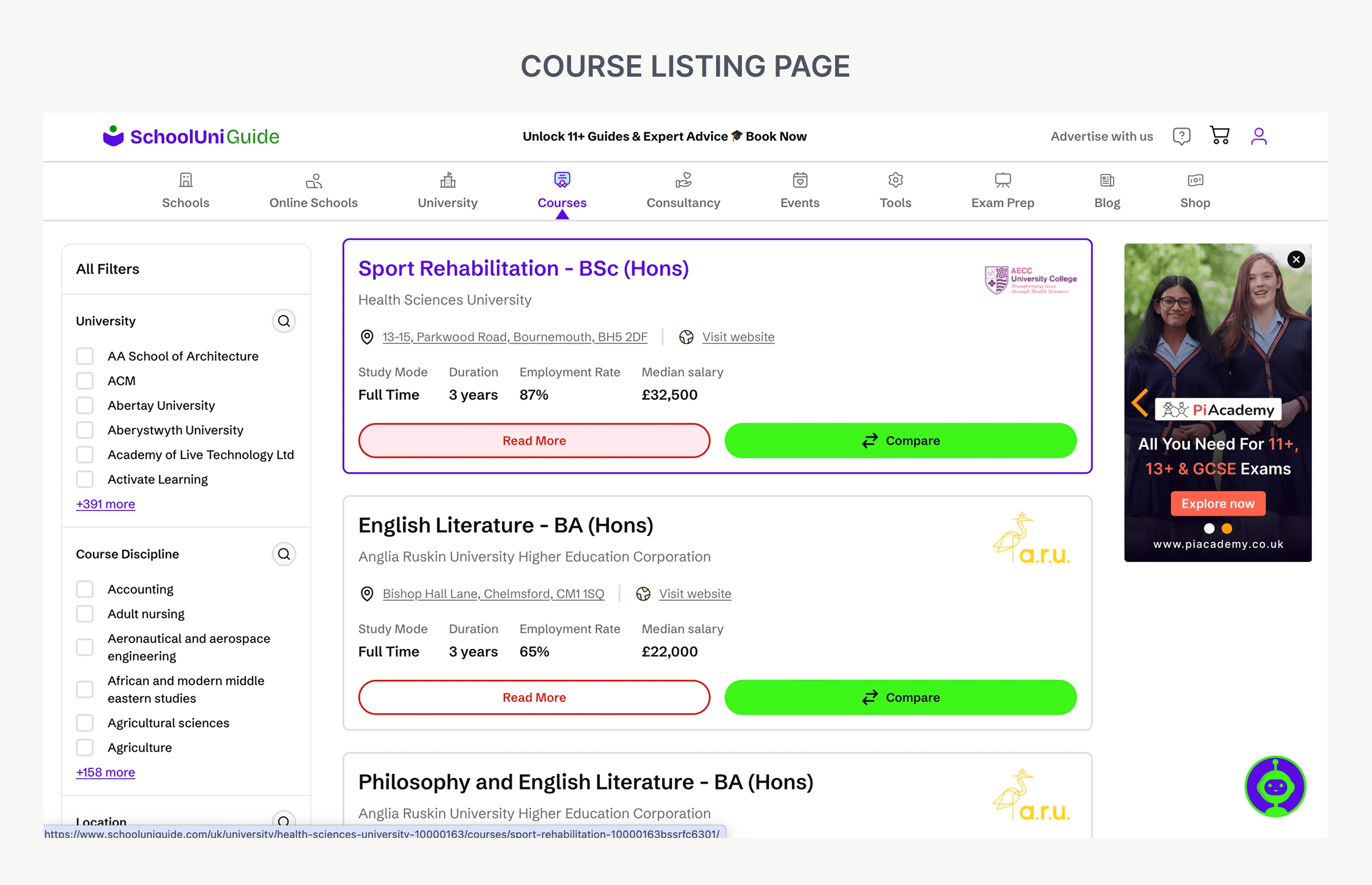
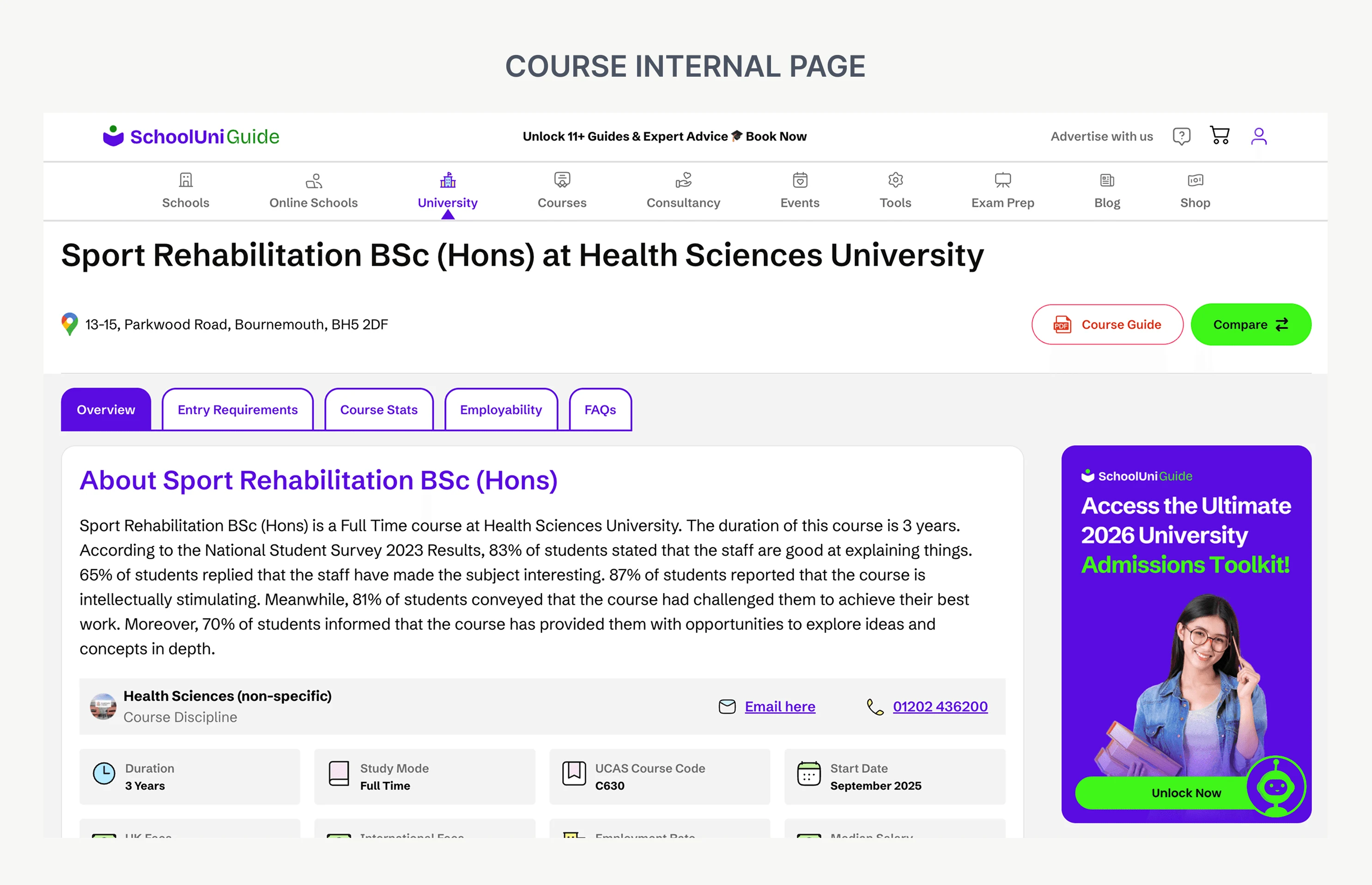
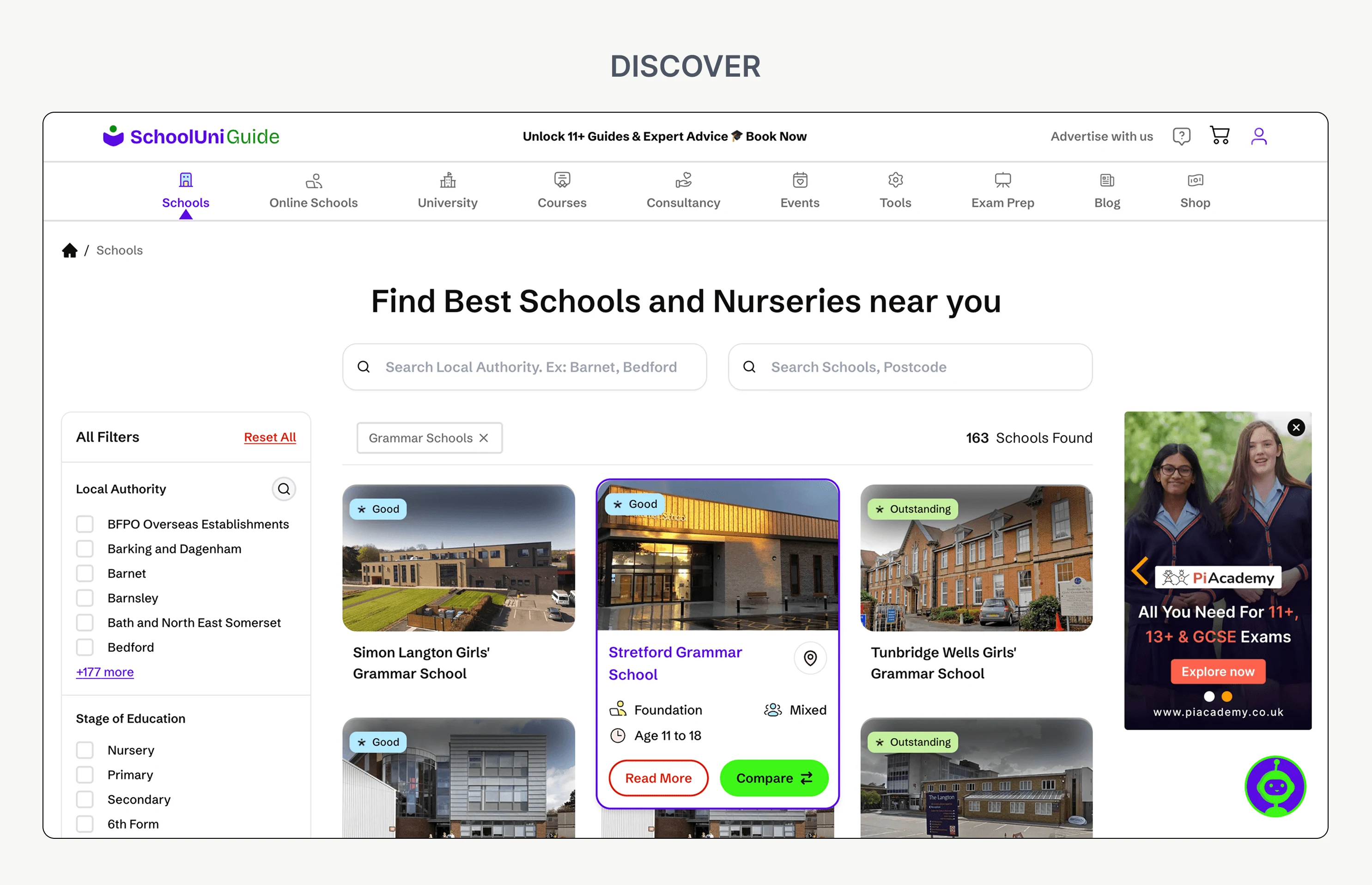
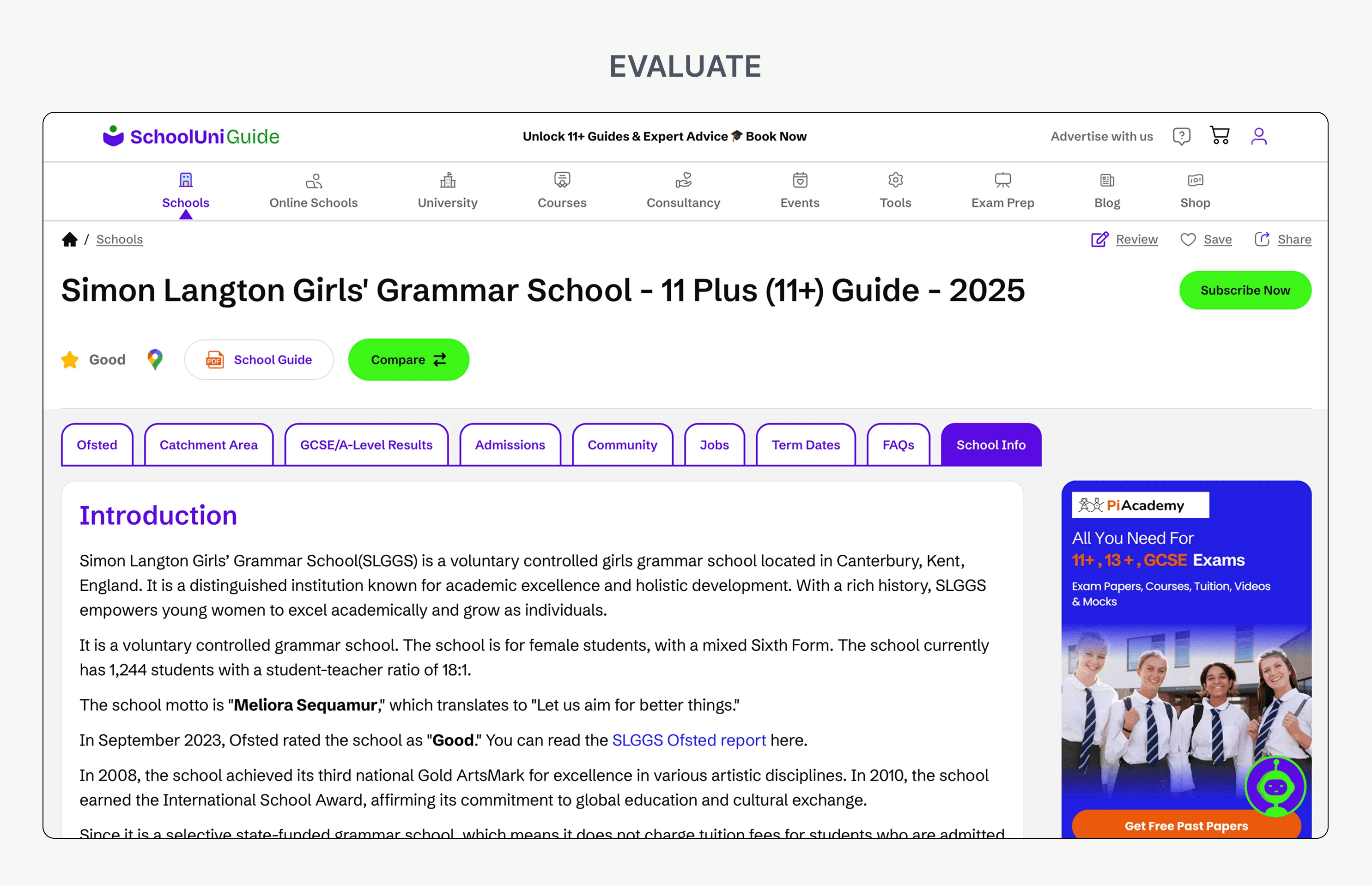
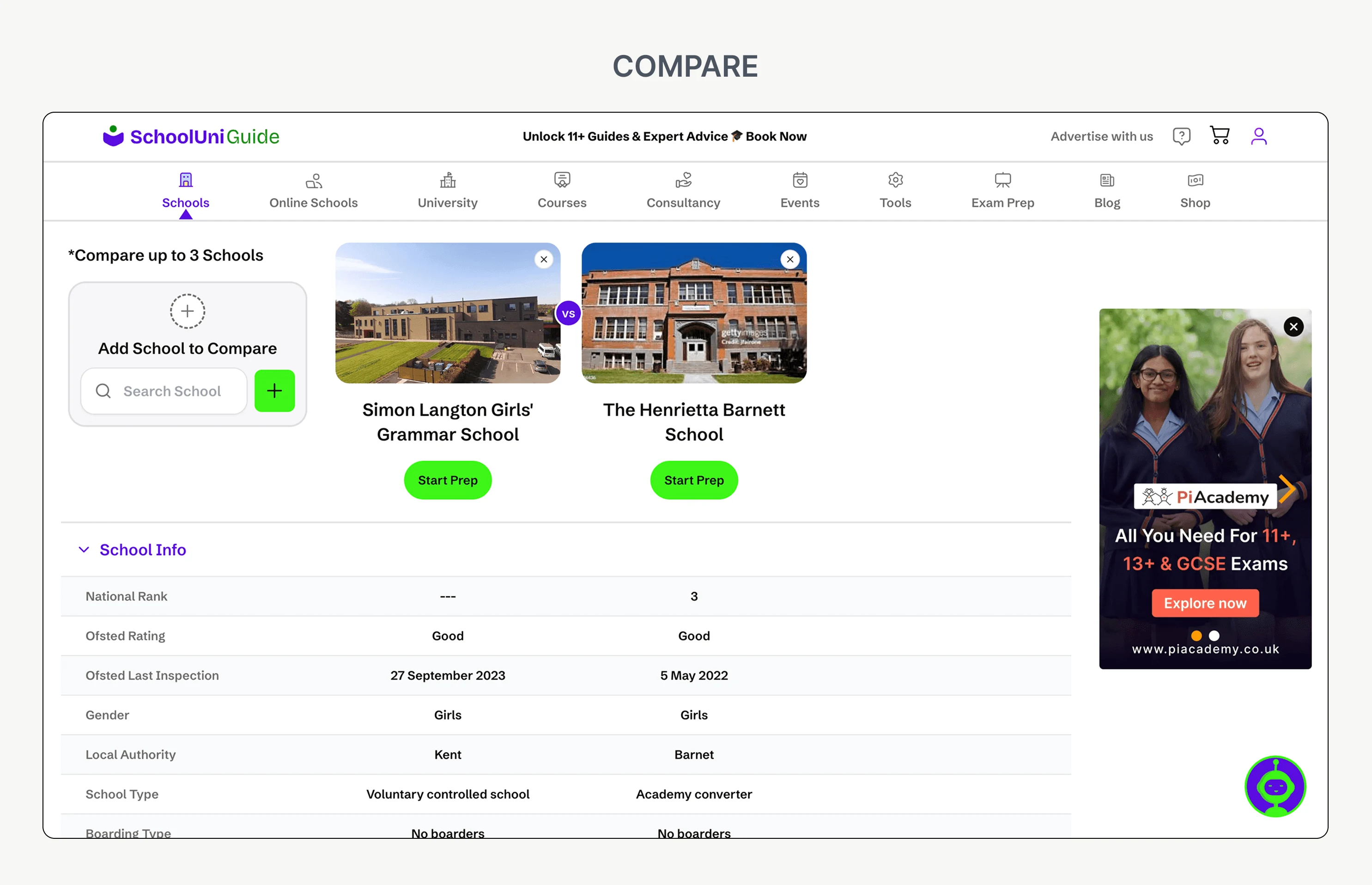
Location, education stage and school-type filters narrow the catalogue. School cards surface Ofsted, type, gender and age, alongside Read More and Compare. Profiles reveal key facts first, with admissions, results, catchment and community available when needed.
Parents can select up to three schools and compare meaningful differences without repeatedly switching between profiles.
- Search
- Filter
- Evaluate
- Select
- Compare
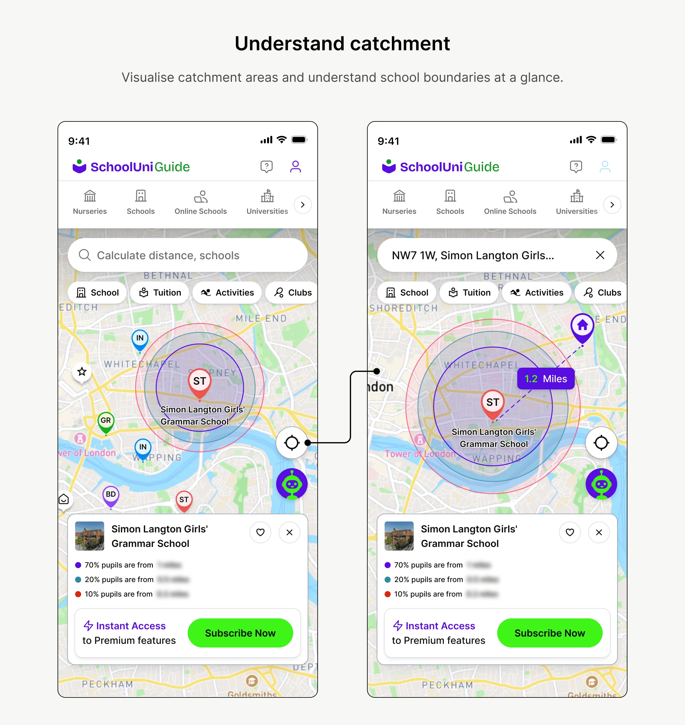
06 — Map & catchment
Location is a decision layer, not an isolated filter.
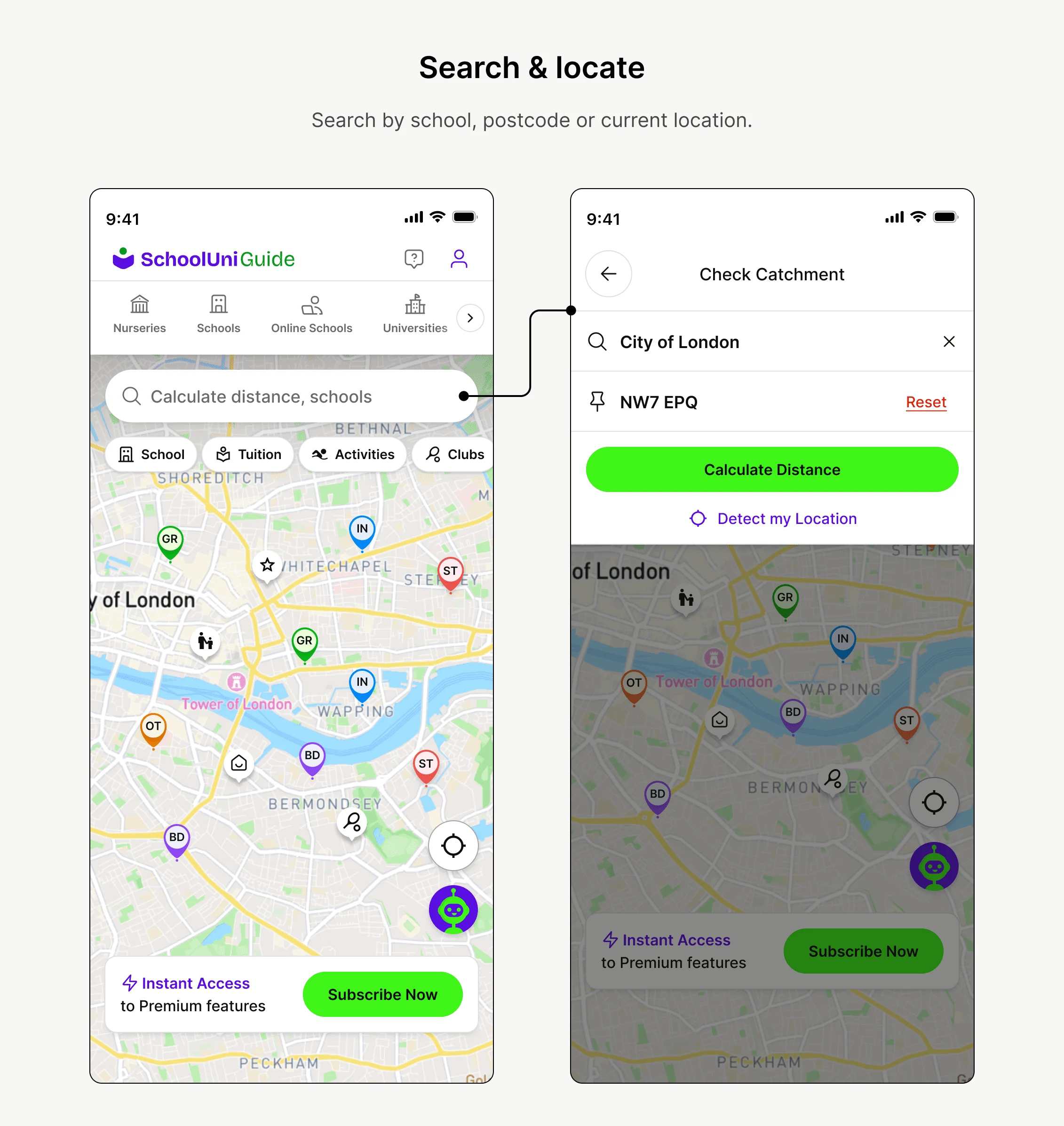
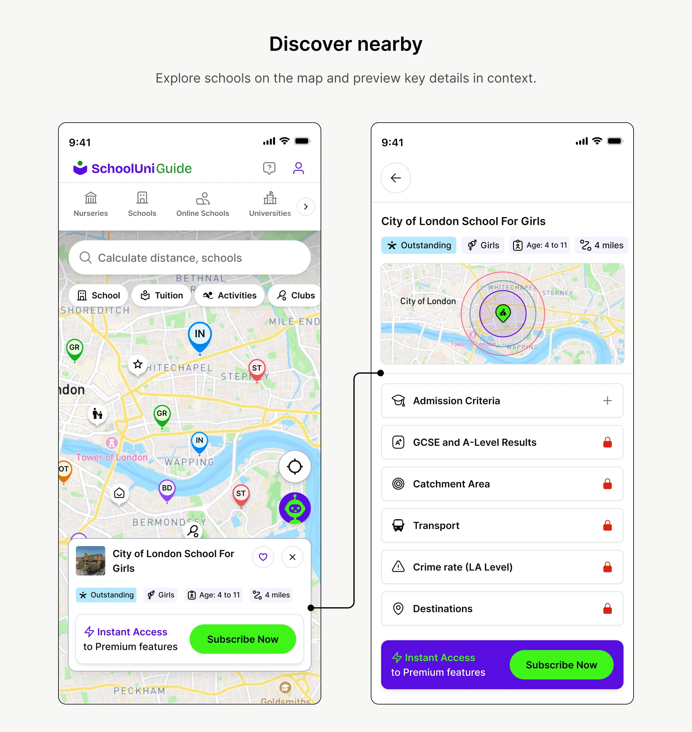
Distance, catchment, nearby schools and local services influence school choice. The map connects them in one spatial experience. A contextual school panel keeps details and nearby services close without making parents lose their place.
07 — Key design decisions
Five decisions — and what each one cost.
01 / The parent’s decision, not the database
Guide discovery through Discover → Locate → Evaluate → Compare, rather than exposing thousands of raw records.
Trade-off: Advanced information is progressively exposed instead of front-loaded.
02 / Location belongs in discovery
Connect distance, catchment and nearby services within the map experience.
Trade-off: More geographic context increases interaction complexity; each layer must stay legible.
03 / Comparison is part of the flow
Make Find → Select → Compare a core interaction, not a separate destination.
Trade-off: Prioritise decision-relevant fields rather than showing every attribute equally.
04 / Earn trust before asking for a subscription
Free access includes school data, safety, diversity, basic comparison and maps. Premium adds catchment, enhanced comparison and maps, nearby amenities and 11+ guides.
Trade-off: Locking too much weakens trust; giving too much away weakens the subscription case.
05 / Consistent, not rigid
Reusable components let universities, courses, exam prep and tools extend the same product language.
Trade-off: Different education decisions still need different information.
08 — Expansion & B2B
From school search to an education ecosystem.
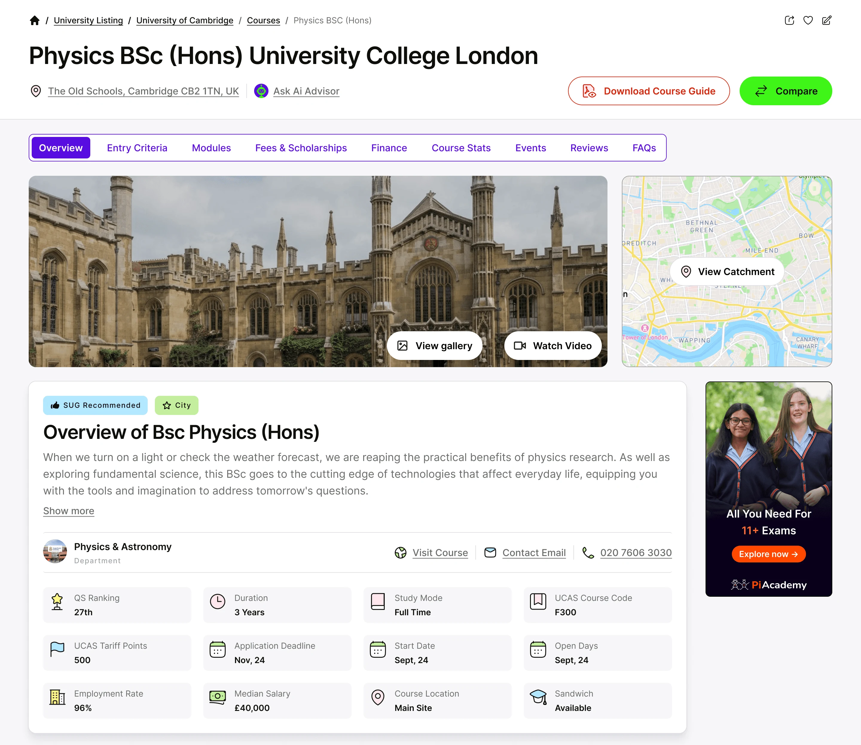
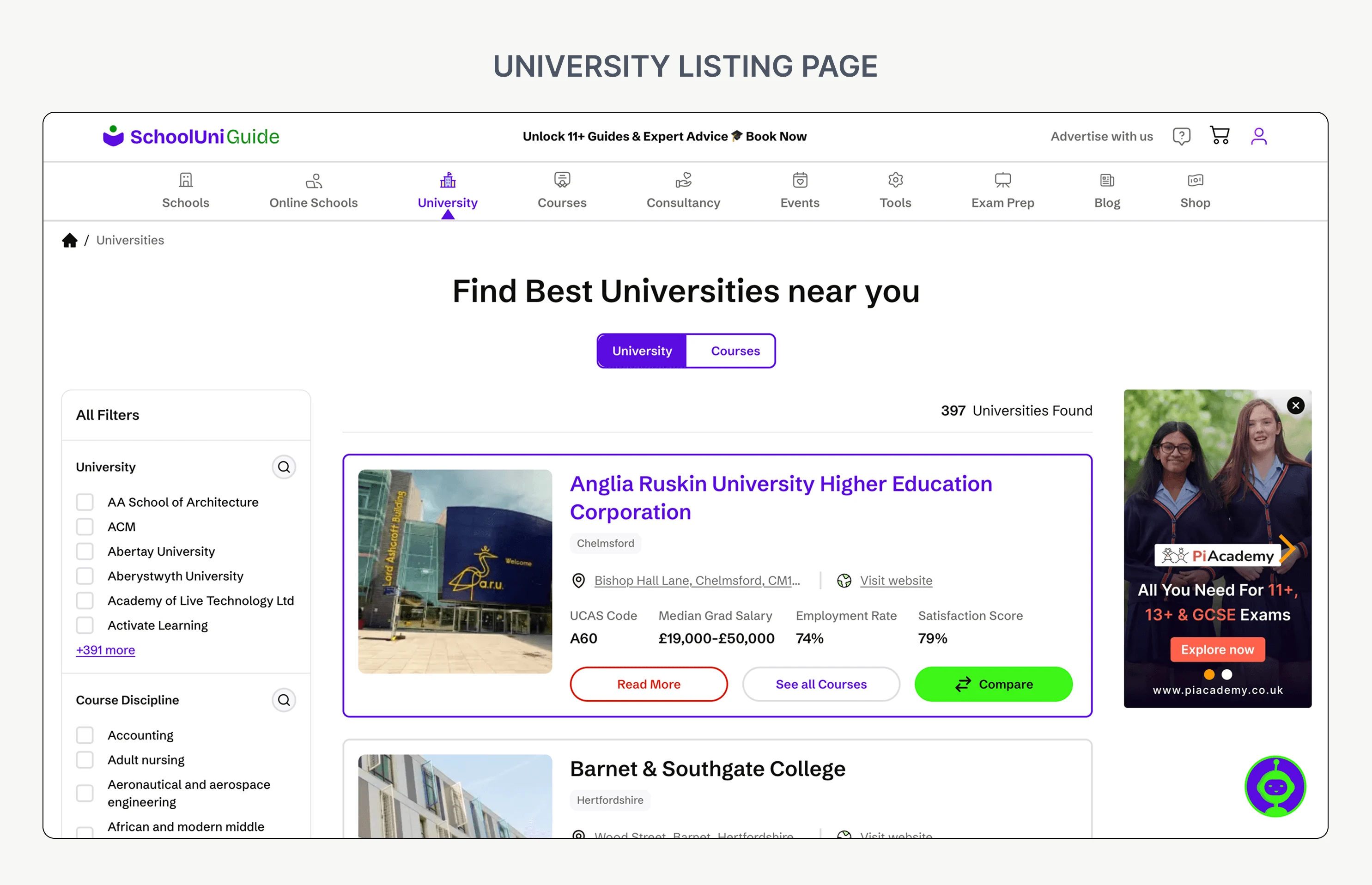
The same decision-support model extended into universities, courses, exam prep, tools and services. Shared layouts and interaction patterns kept those additions connected to the original product.
A premium provider model gave education businesses, including tutoring companies, better visibility and more relevant access to families instead of filling the experience with ads. The supplied case study reports more than ten tutoring companies joining as premium partners.
B2B should strengthen discovery — not compromise it.
09 — Final experience
One connected education journey across web and mobile.
10 — Design system & delivery
A foundation for a product that was still growing.
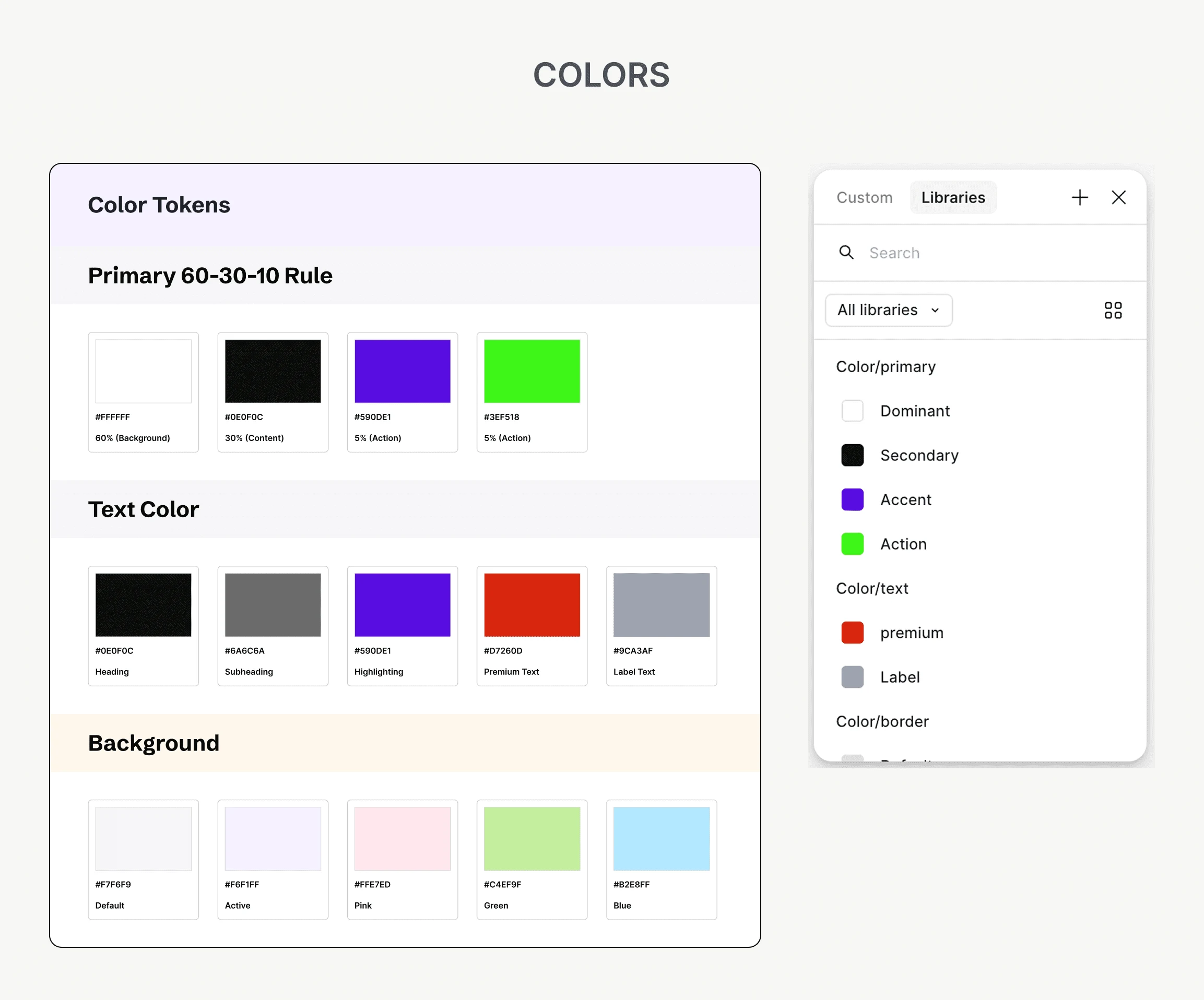
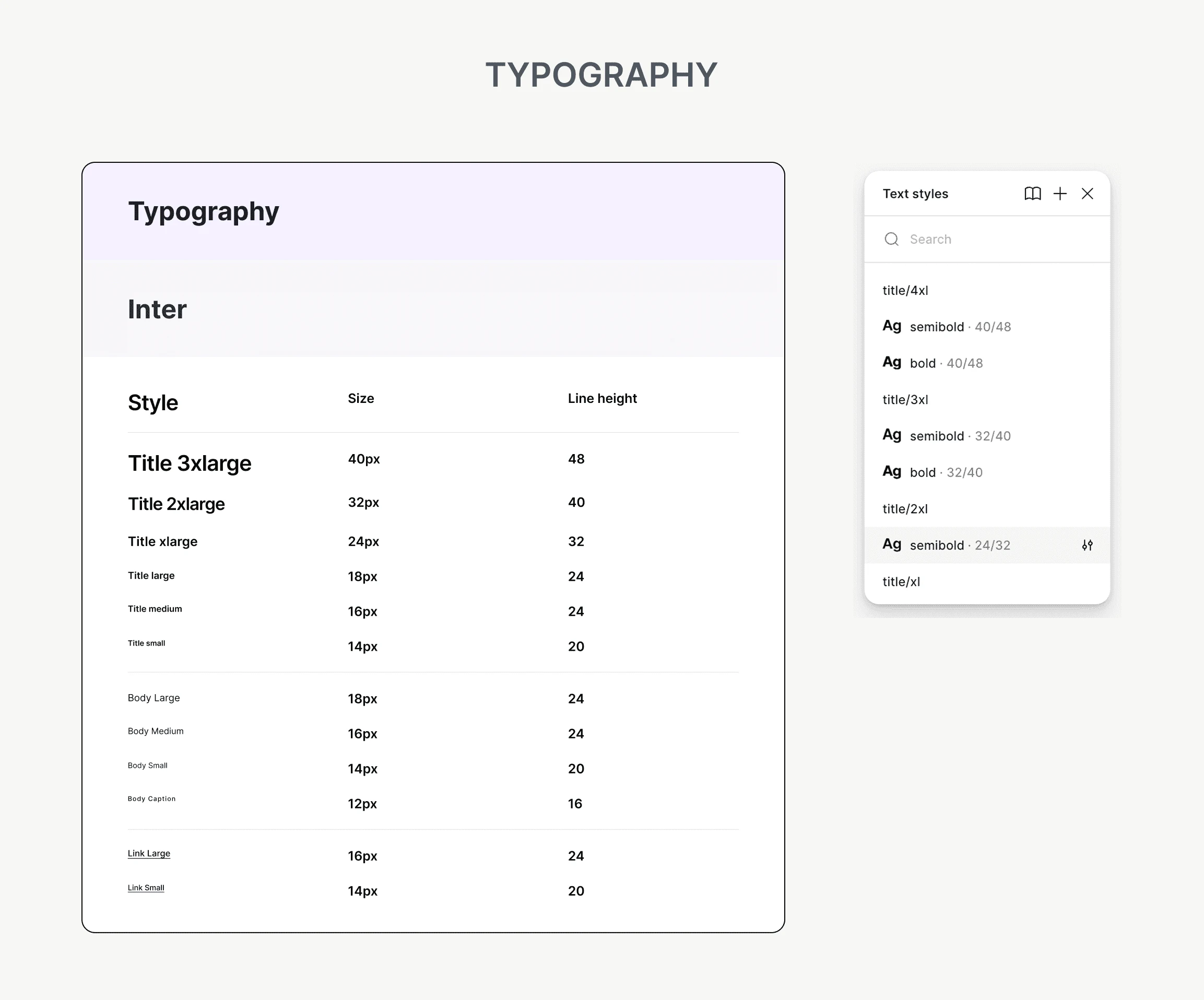
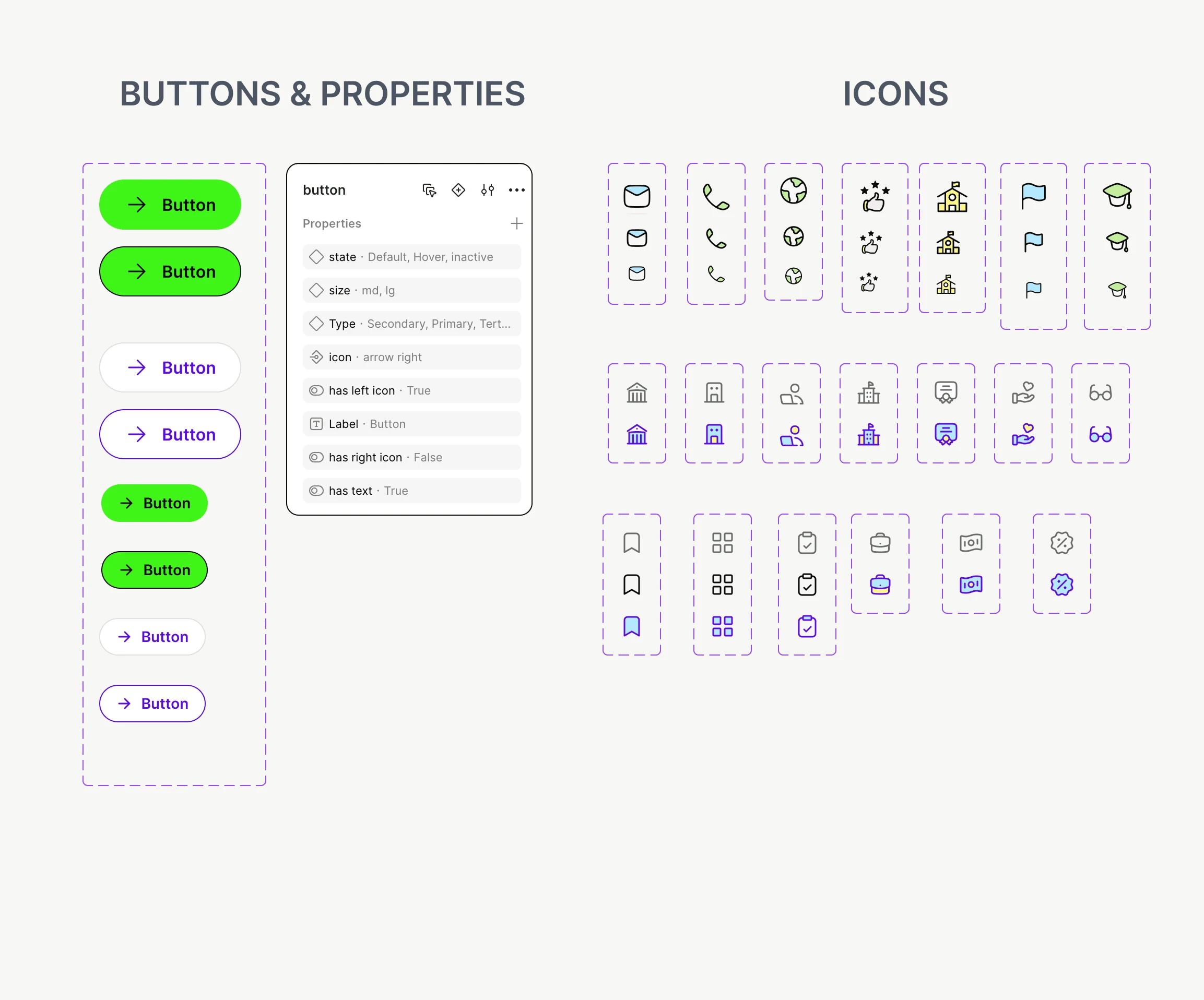
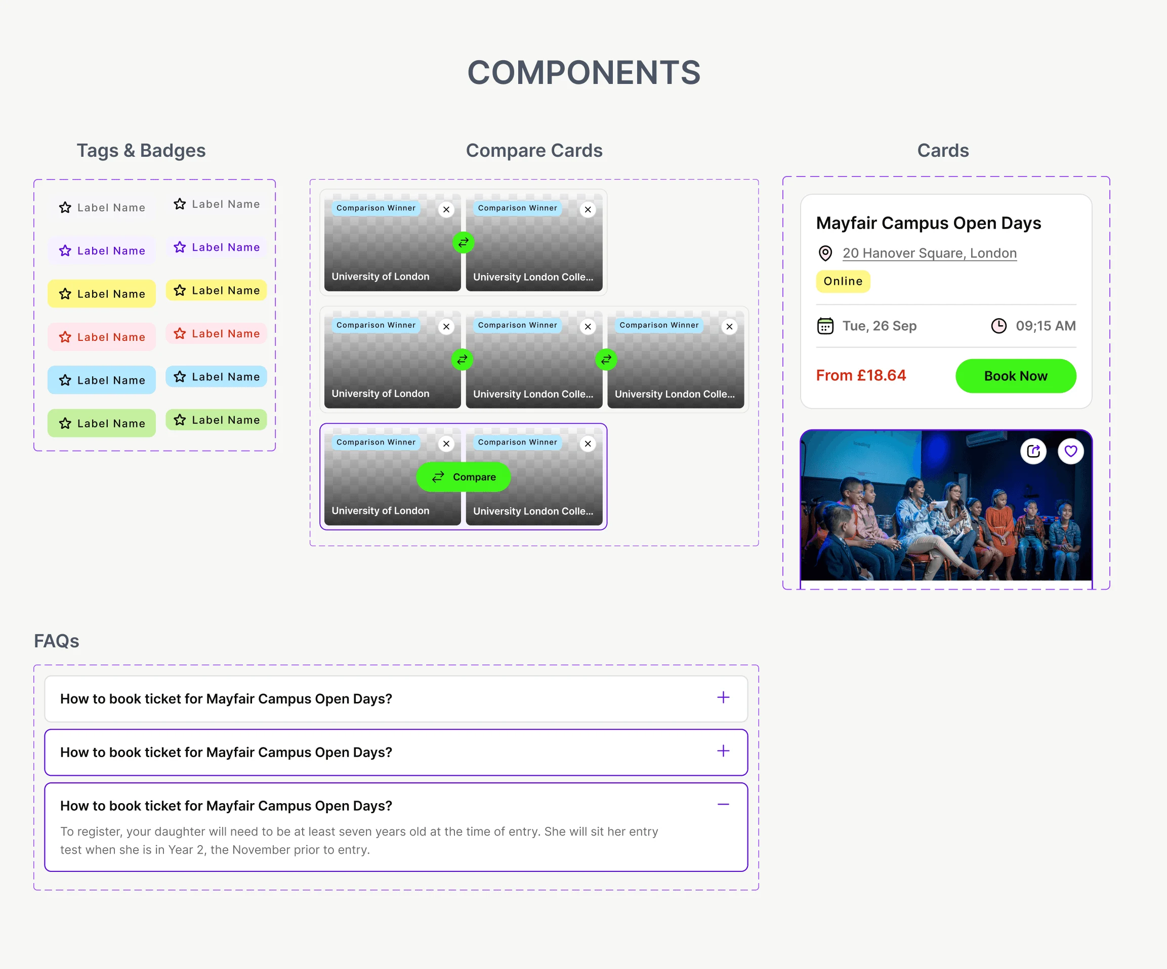
Reusable web and mobile patterns established colour roles, typography, buttons, icons, cards, tabs, badges and FAQs from the start. New education products could extend the same visual and interaction language.
Architecture and user flows came before UI. Early wireframes and prototypes informed the system, while collaboration through engineering and QA brought technical constraints into the design before handoff.
11 — Impact
From an idea to a growing education platform.
The supplied case study reports 27,000+ school listings, 20,000+ nearby amenities and 10+ tutoring firms on premium. These describe the platform’s scale, not measured improvements caused by the design.
The product expanded into a premium B2B model, with AI features introduced as it evolved.
Scale figures are attributed to the original School Uni Guide case study; no conversion or usability uplift is claimed.
12 — Reflection
The hardest part wasn’t the first screen. It was defining the product.
A school or university is more than a static profile. Geographic context shapes a family’s decision, and the map made that context tangible.
Build components that solve today’s need without making tomorrow’s product harder to design. The next opportunity is moving from helping parents research to helping them make confident education decisions.
Next case
PiAcademy / Scale
Have an idea
worth making real?
Tell us what you’re building. Let’s find the right next step.