OpenApp: Making the software stack visible, manageable and worth the spend.
Making the software stack visible, manageable and worth the spend.
- Category
- Product Design · UX Strategy · Design System
- Industry
- Software · Subscription intelligence
- Design scope
- UX Strategy · UI · Design System
- Year
- Concept
- Timeline
3 months
- Team
- Independent · Self-initiated · Not deployed
- Platforms
- Web concept · Individual & Company views
A self-initiated concept for tracking software and AI subscriptions, understanding cost and surfacing cheaper alternatives — for one person or a whole team.
01 — The idea & problem
The way we work is becoming a stack of subscriptions.
OpenApp began with an observation of modern work environments: we subscribe to tools, use them for a while, forget them, miss renewals and rarely know who is using what.
The problem was not finding software. It was subscription blindness, missing utilization context, overlapping tools and growing complexity around ownership, permissions and team allocation.
Make the software stack visible, manageable and worth the spend.
02 — Product architecture
Four connected jobs, one tool inventory.
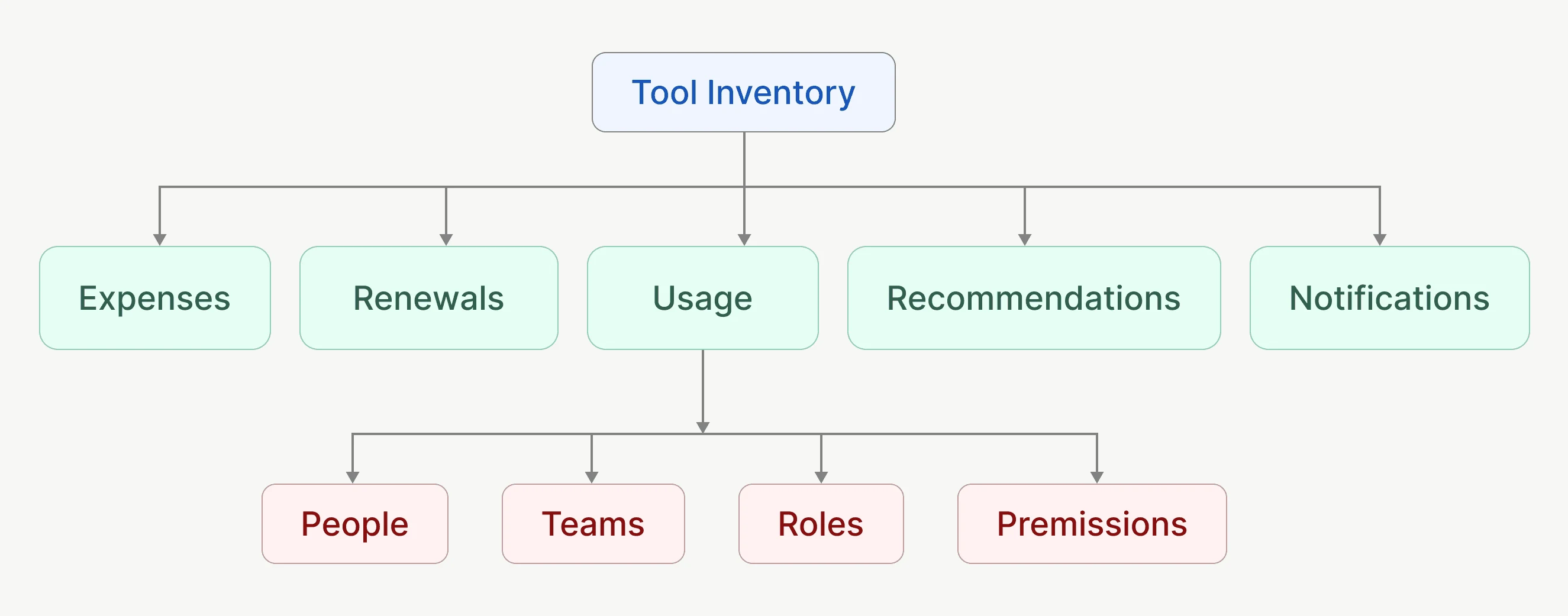
Track subscriptions in a shared inventory. Understand spending, trends, renewals and usage. Optimize by surfacing potential savings and lower-cost alternatives. Control people, teams, ownership and access.
Individuals need fast spend visibility, renewal warnings and personal alternatives. Company admins need spend by person, team and category, access roles, and budget versus actual. This split was treated as foundational, not an add-on.
- Track
- Understand
- Optimize
- Control
03 — Exploration
Sketch the questions before the metrics.
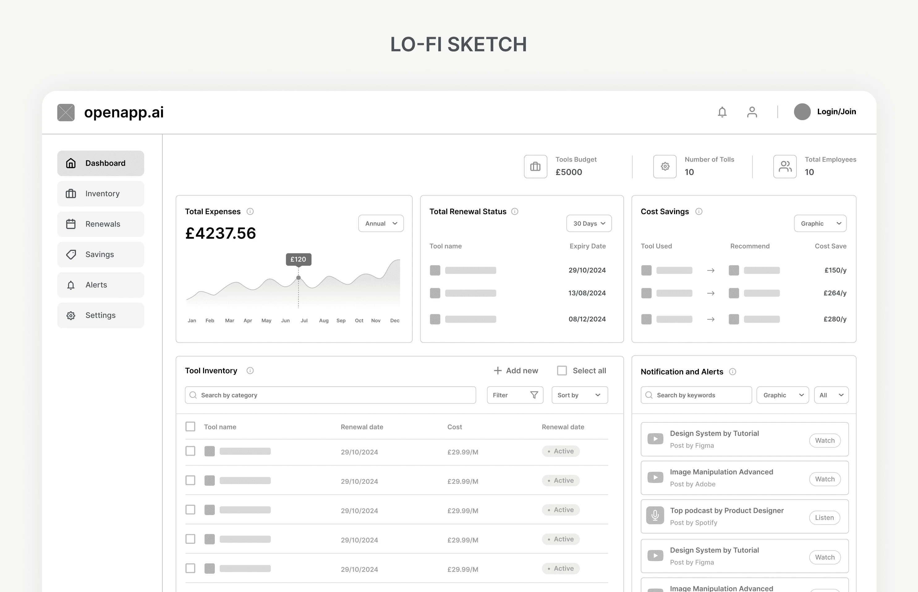
The overview was shaped around what needs attention, what costs the most and where savings might exist — so each module justified its place through a decision.
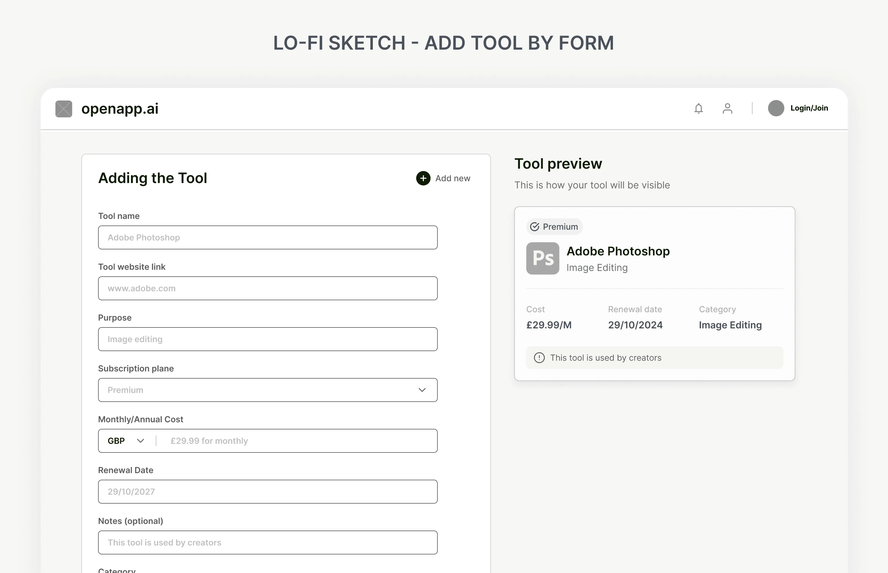
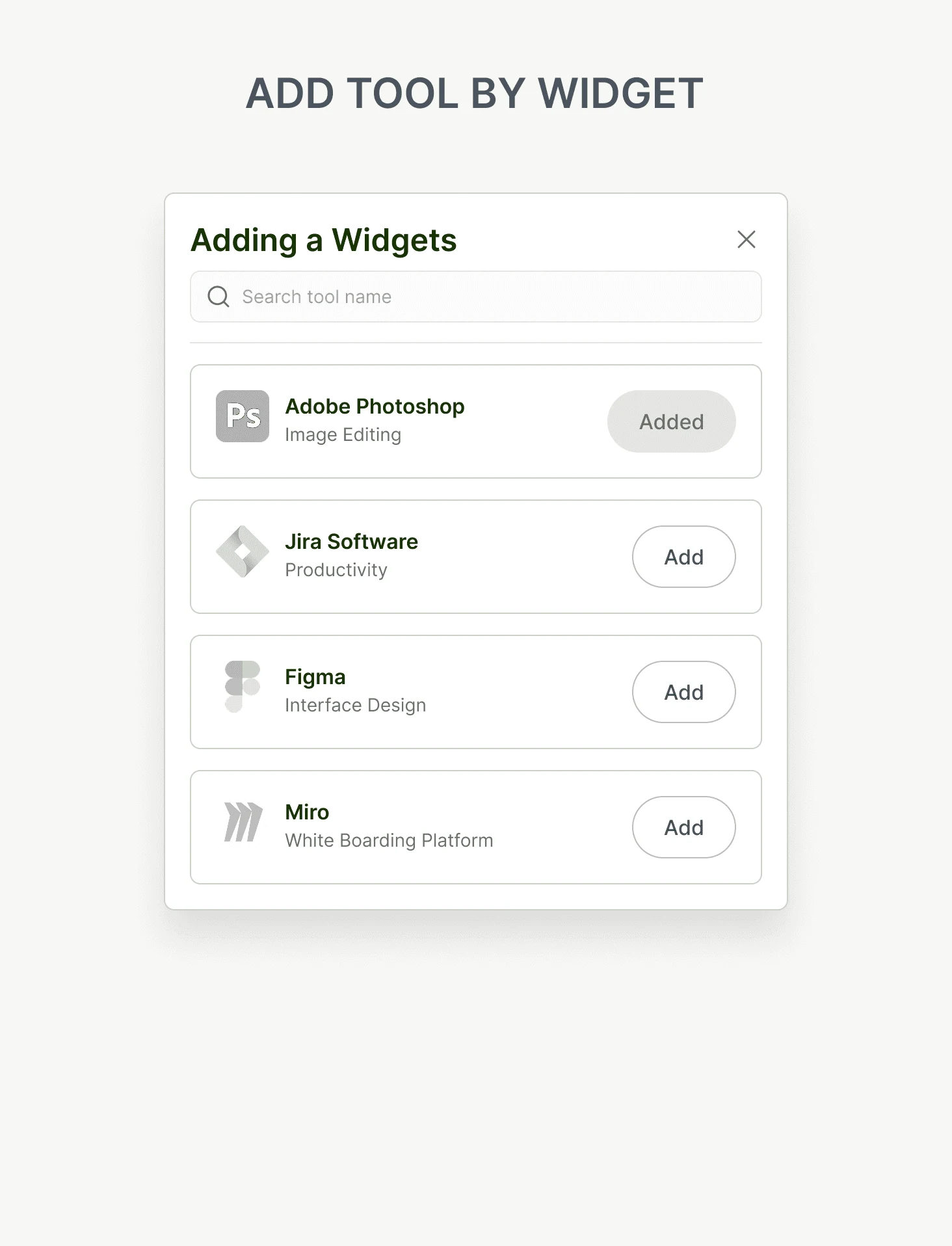
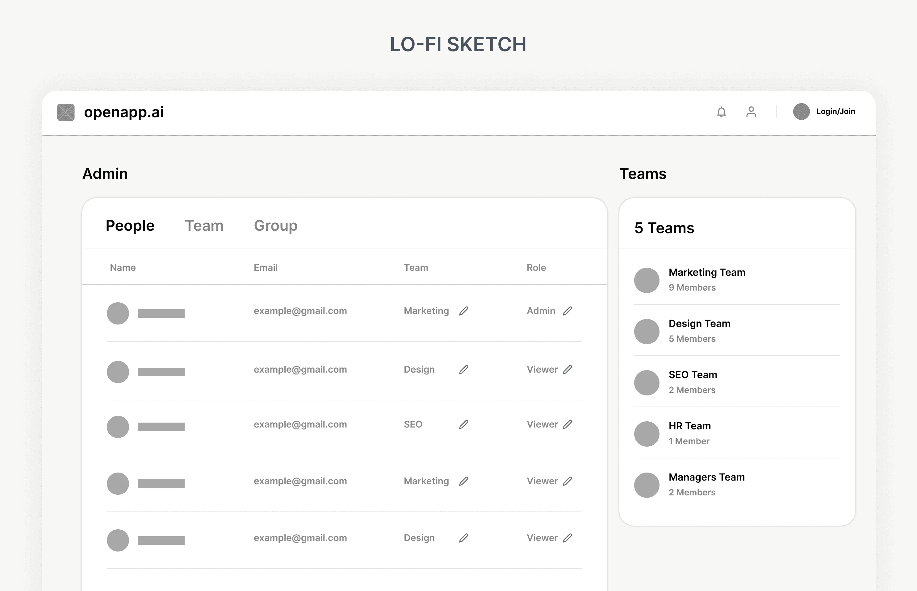
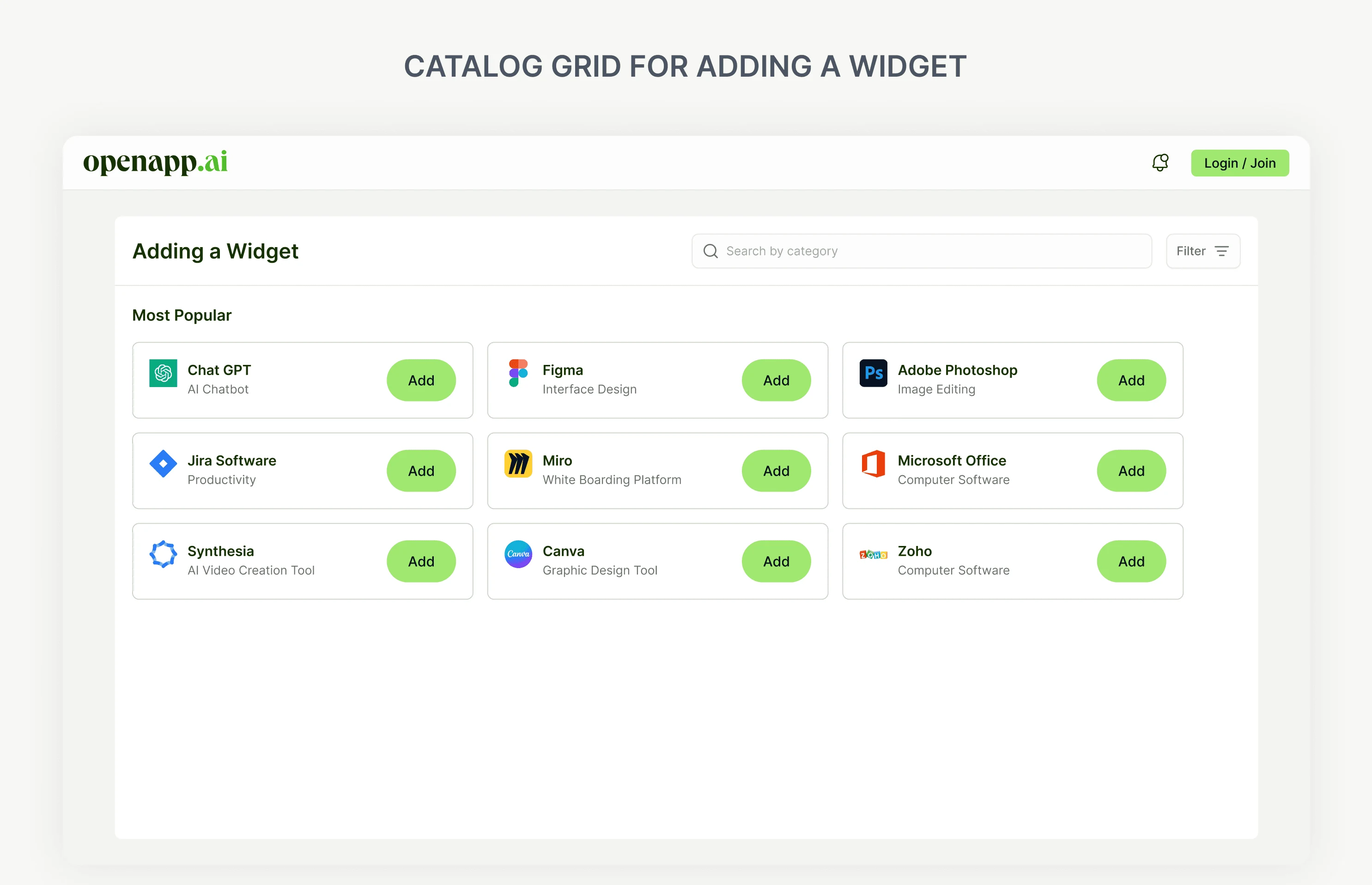
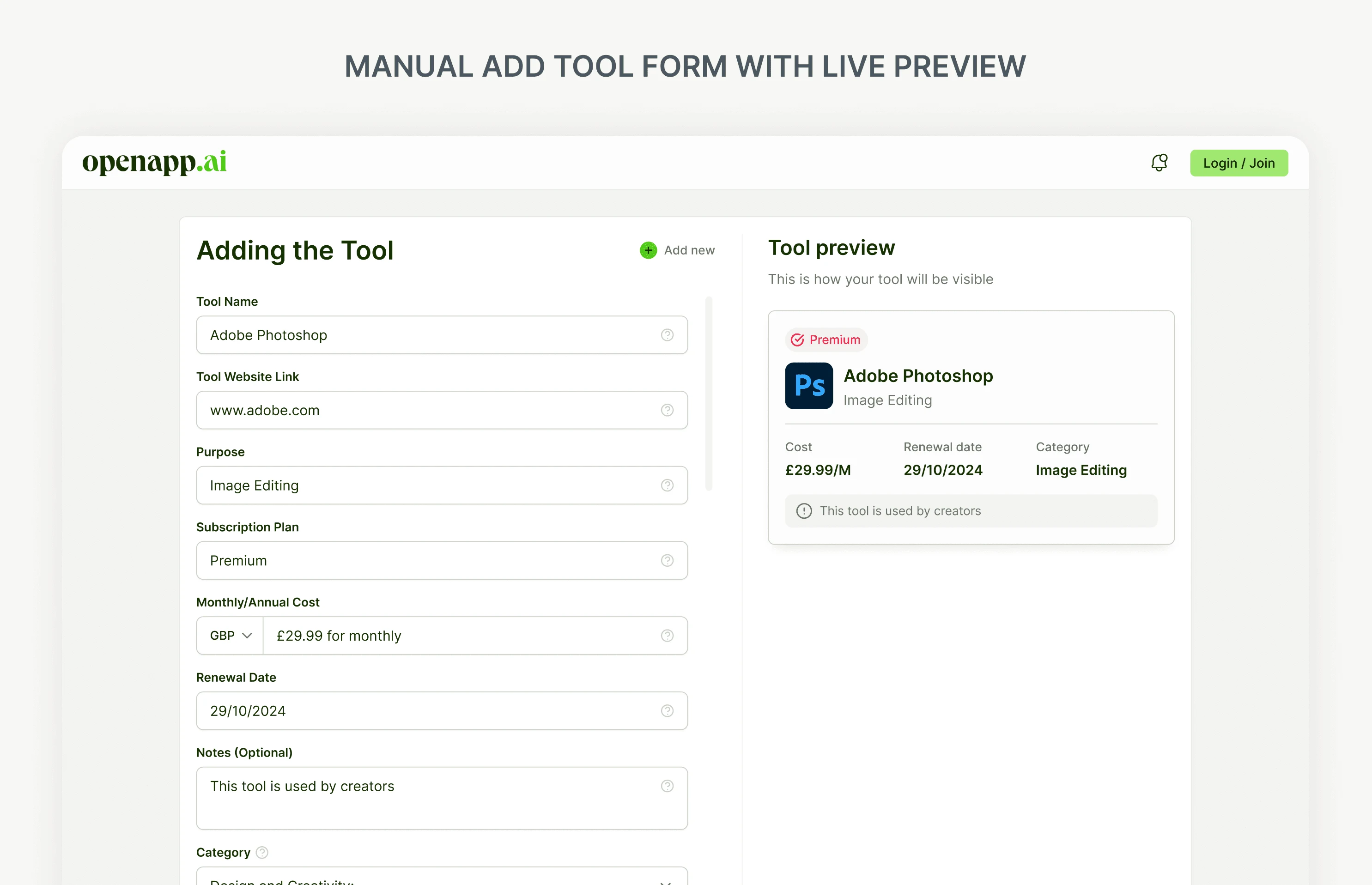
For adding tools, sketches explored a manual form alongside a faster catalogue path for common software. Early concept mapping also separated shared individual and company structure from admin-specific needs.
04 — Adding a tool
Fast for common tools. Flexible for everything else.
The catalogue provides a quick way to add recognized tools. Manual entry captures other subscriptions, with a live preview of the tool record. Both paths feed the same inventory.
05 — Understanding spend
A decision surface, not just an expense total.
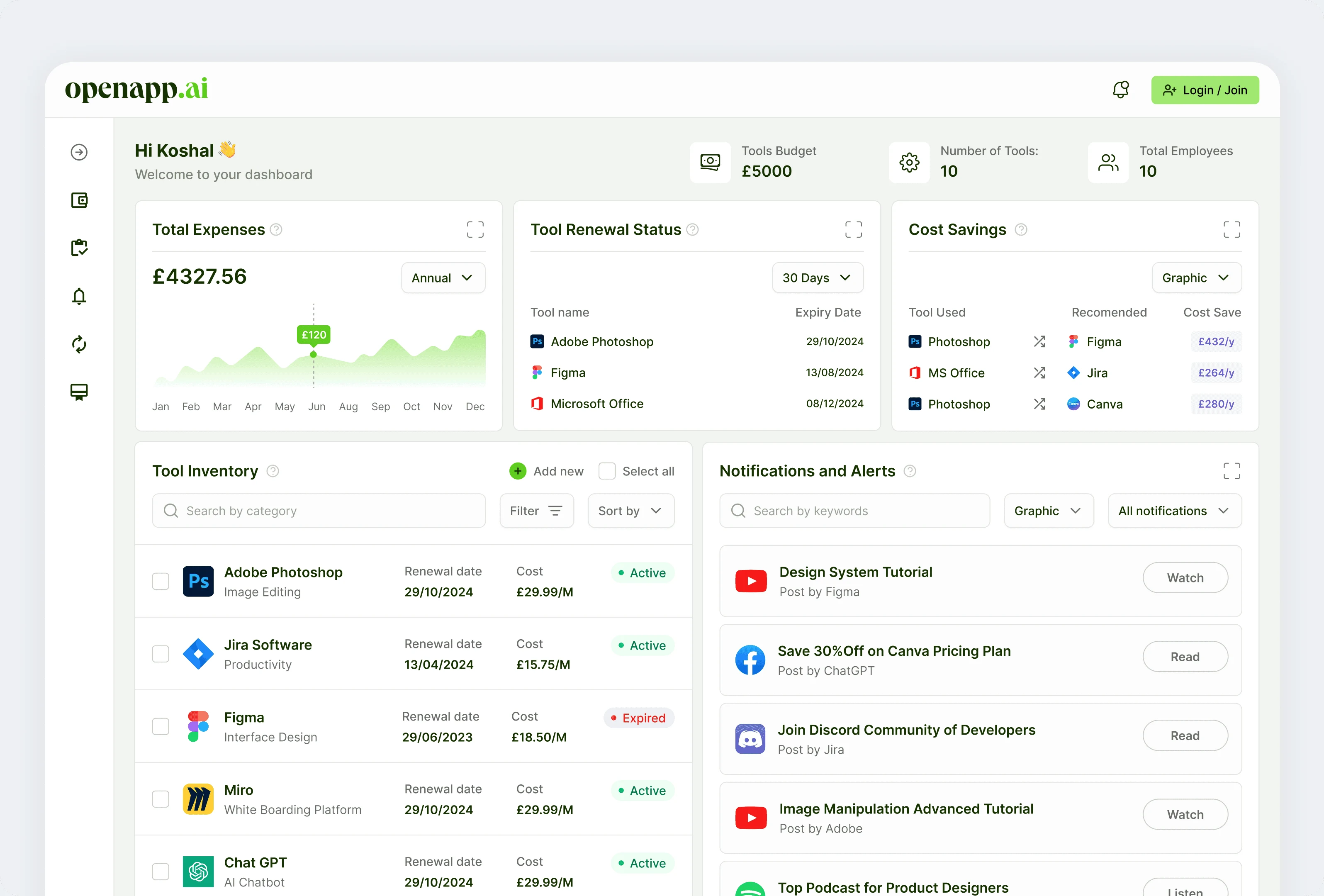
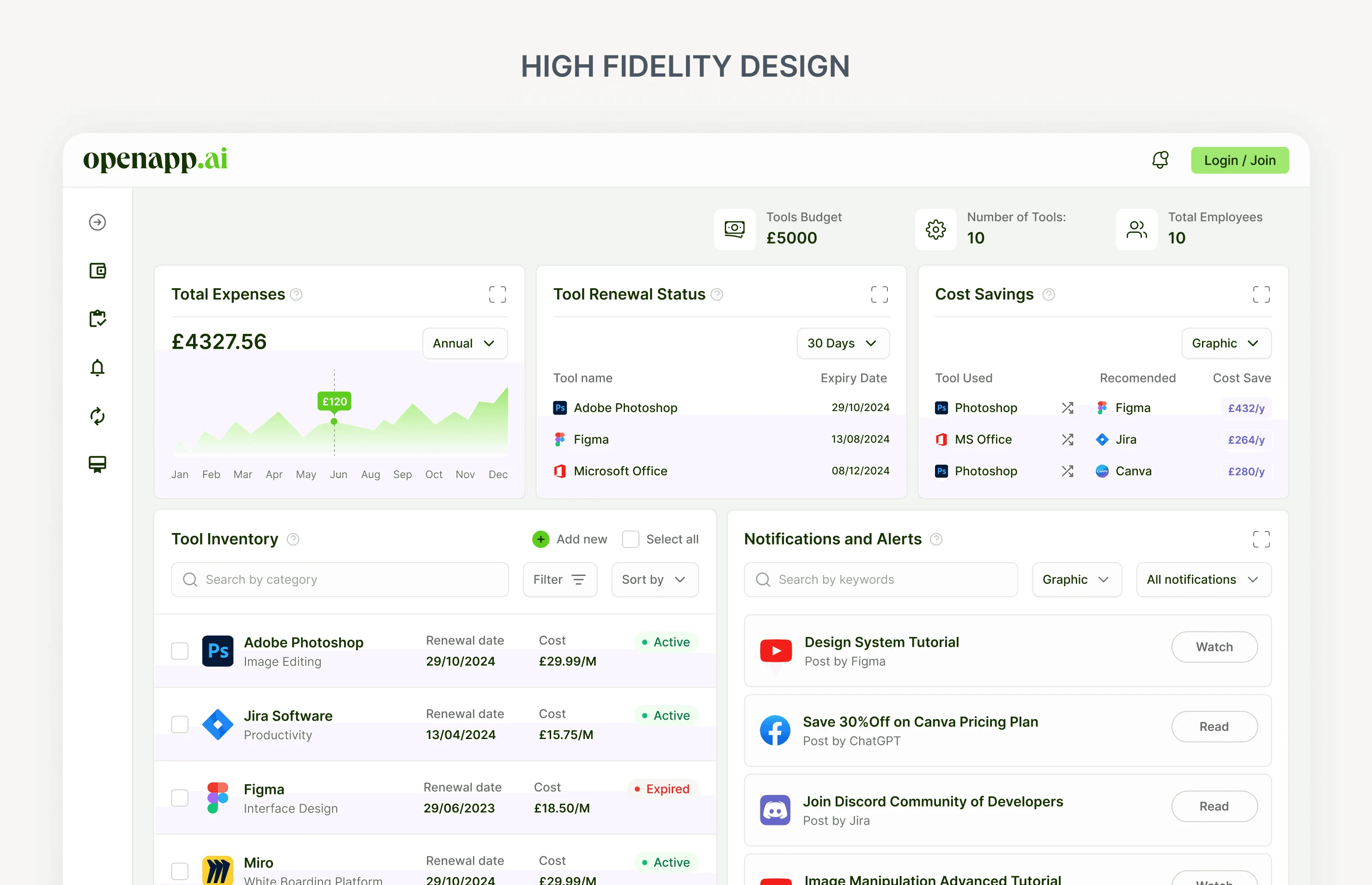
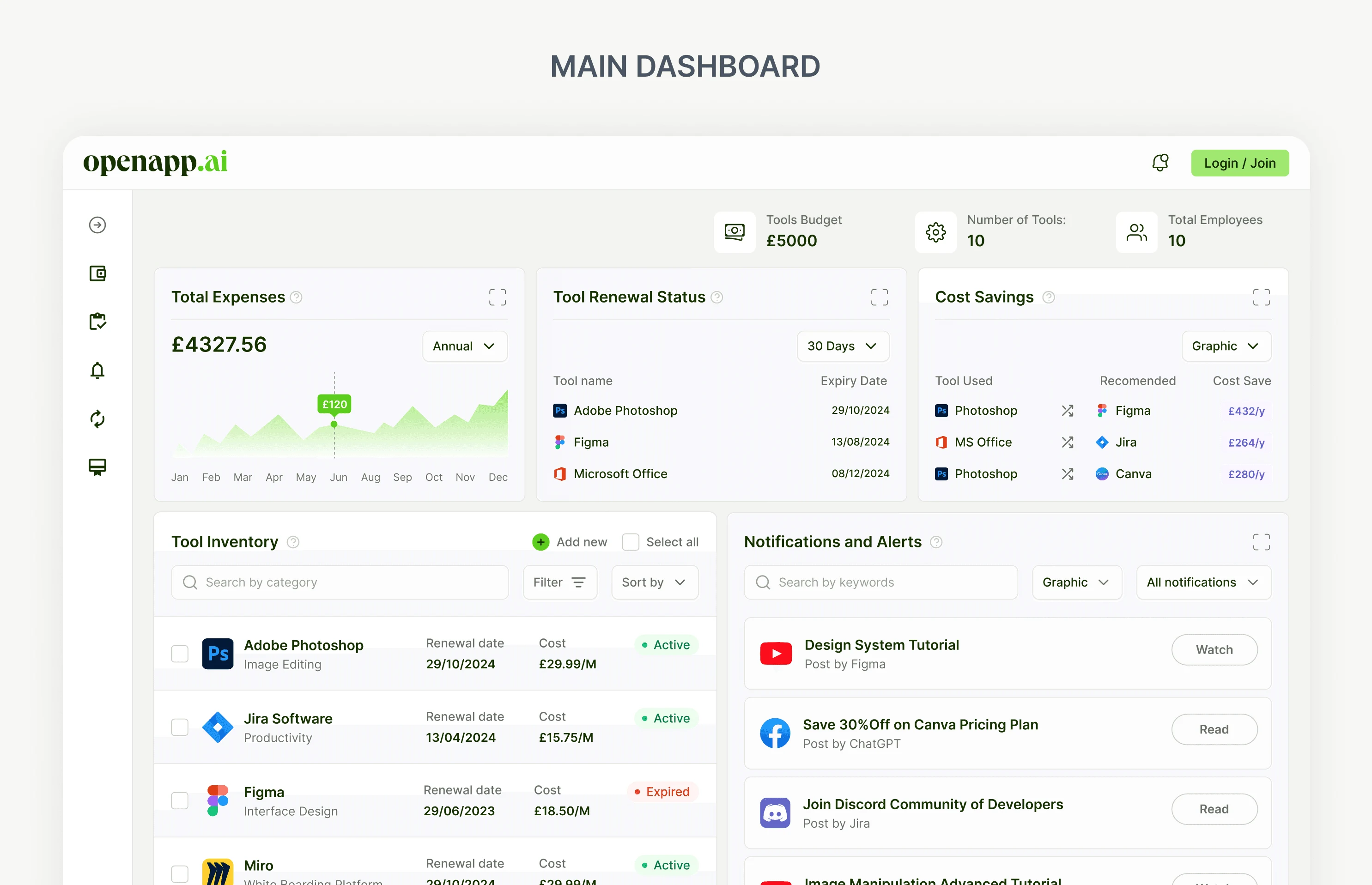
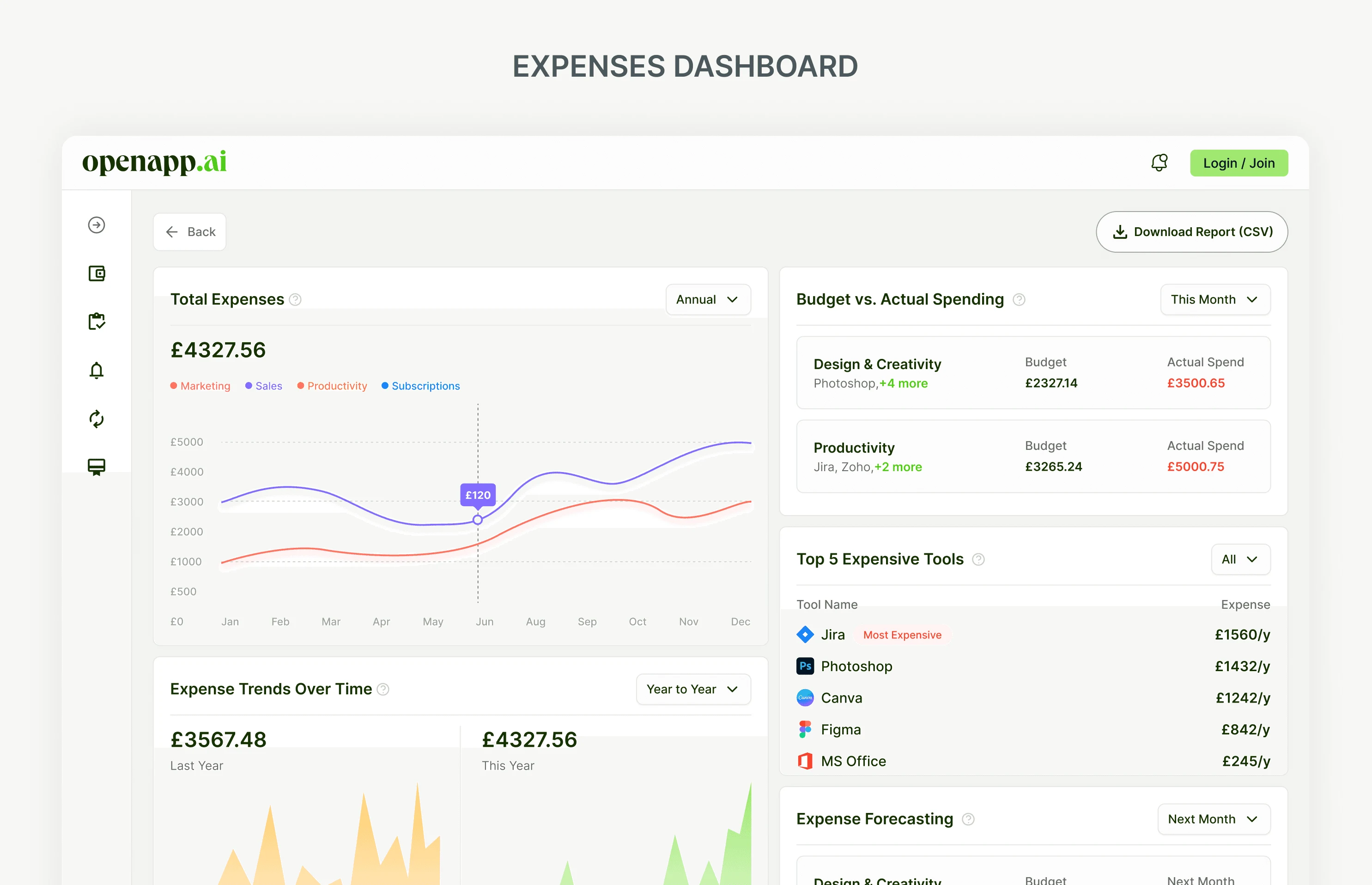
The overview connects spend, renewals, inventory and potential alternatives. The expenses view adds trends and category breakdowns, giving individuals and admins more context for their next decision.
All screens show concept/demo data — not measured spending or validated savings.
06 — Team & access
Company complexity needs its own view.
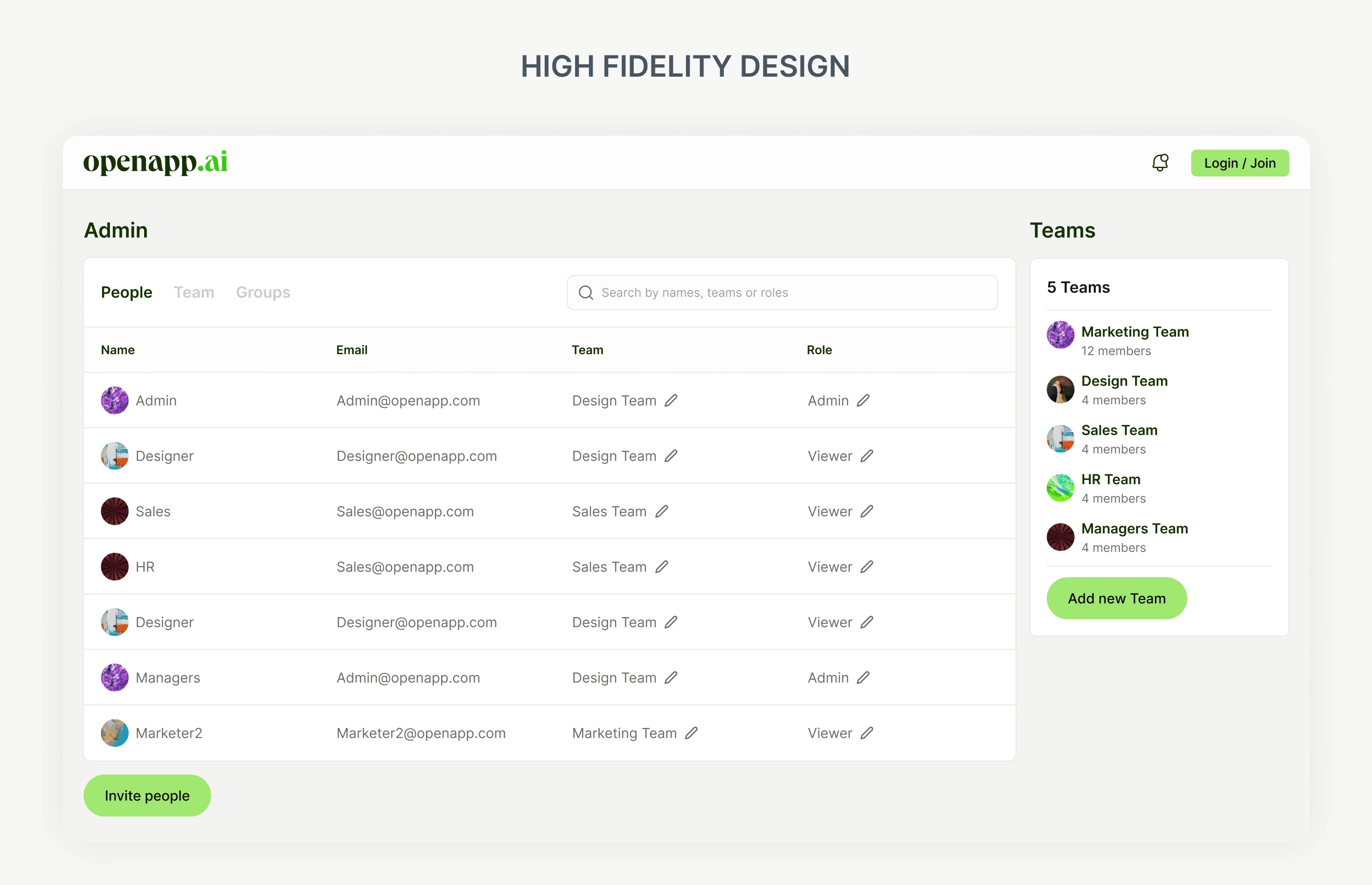
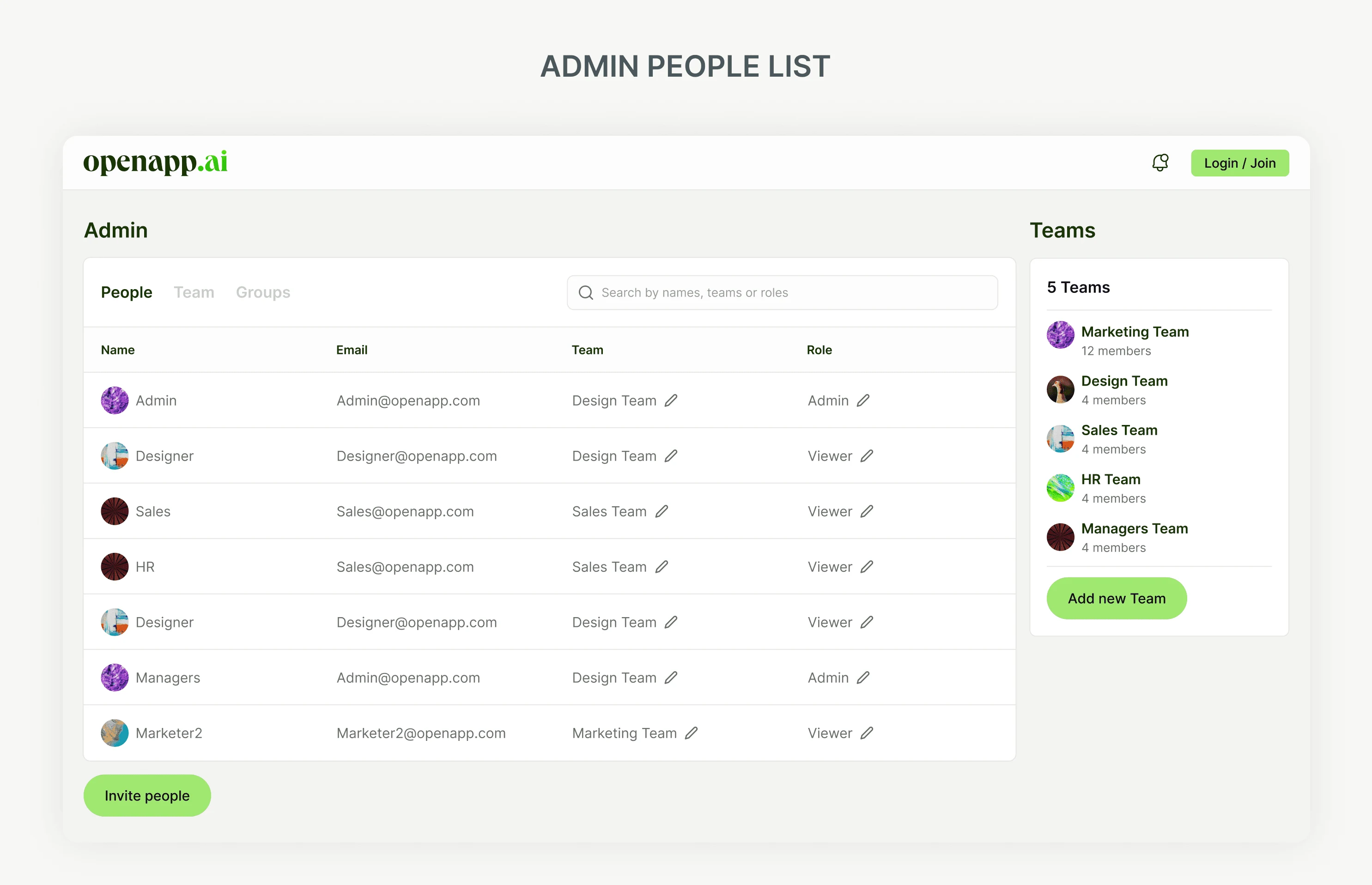
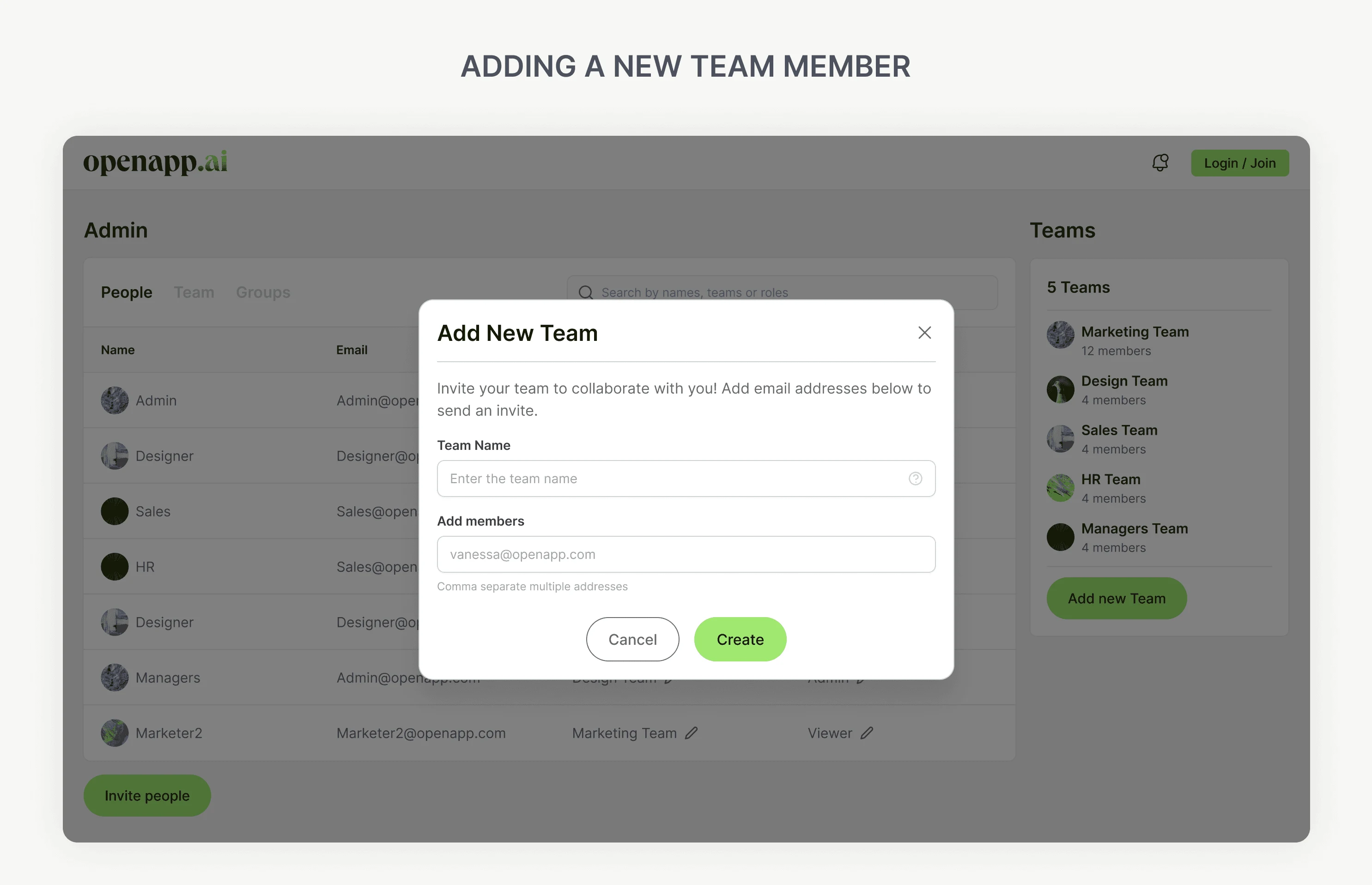
The admin experience connects people, teams and access roles to the inventory. Team creation and people management sit alongside the same software records, rather than becoming disconnected modules.
07 — The recommendation decision
A savings claim needs to be traceable.
A total spend number explains what happened. A lower-cost alternative is meant to help change what happens next. Considerations included price-only sorting, rule-based matching and a learned recommendation model.
A conceptual rule-based approach was selected: the same category, overlapping core features and a lower price. A learned model would need data and scale this concept does not have.
- Tool
- Alternative
- Potential annual savings
Trade-off
Category and feature overlap miss workflow nuance. Figma is not a clean substitute for Photoshop’s print workflow, even if both sit in a broad design category.
Designed, not validated
The tool → alternative → annual savings interaction is ready to test before matching logic is built. It has not been connected to real usage data.
Recommendation logic is conceptual. No working engine, accuracy claim or realized savings is implied.
08 — Design system
One set of components, built once.
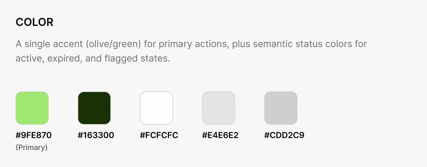
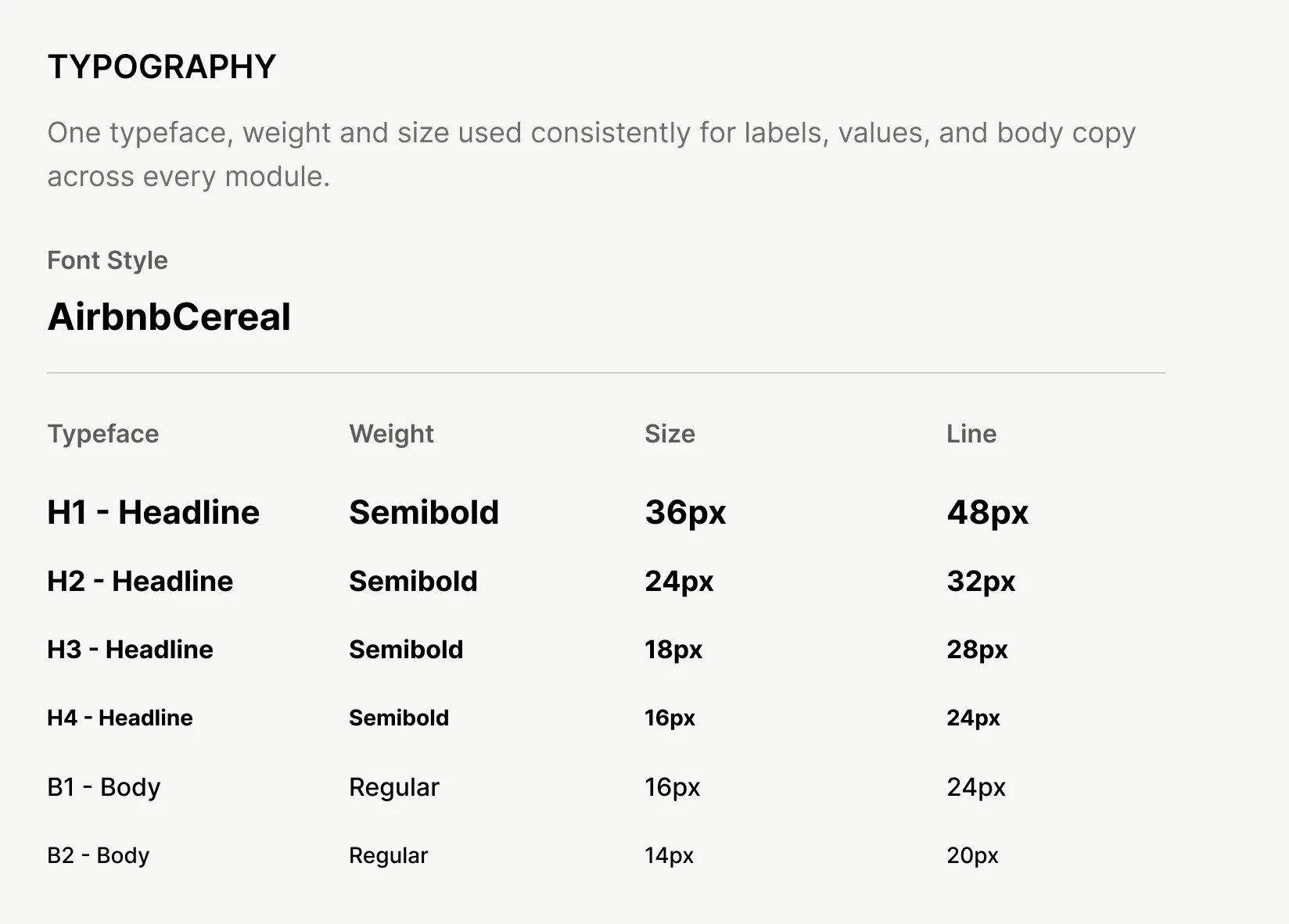
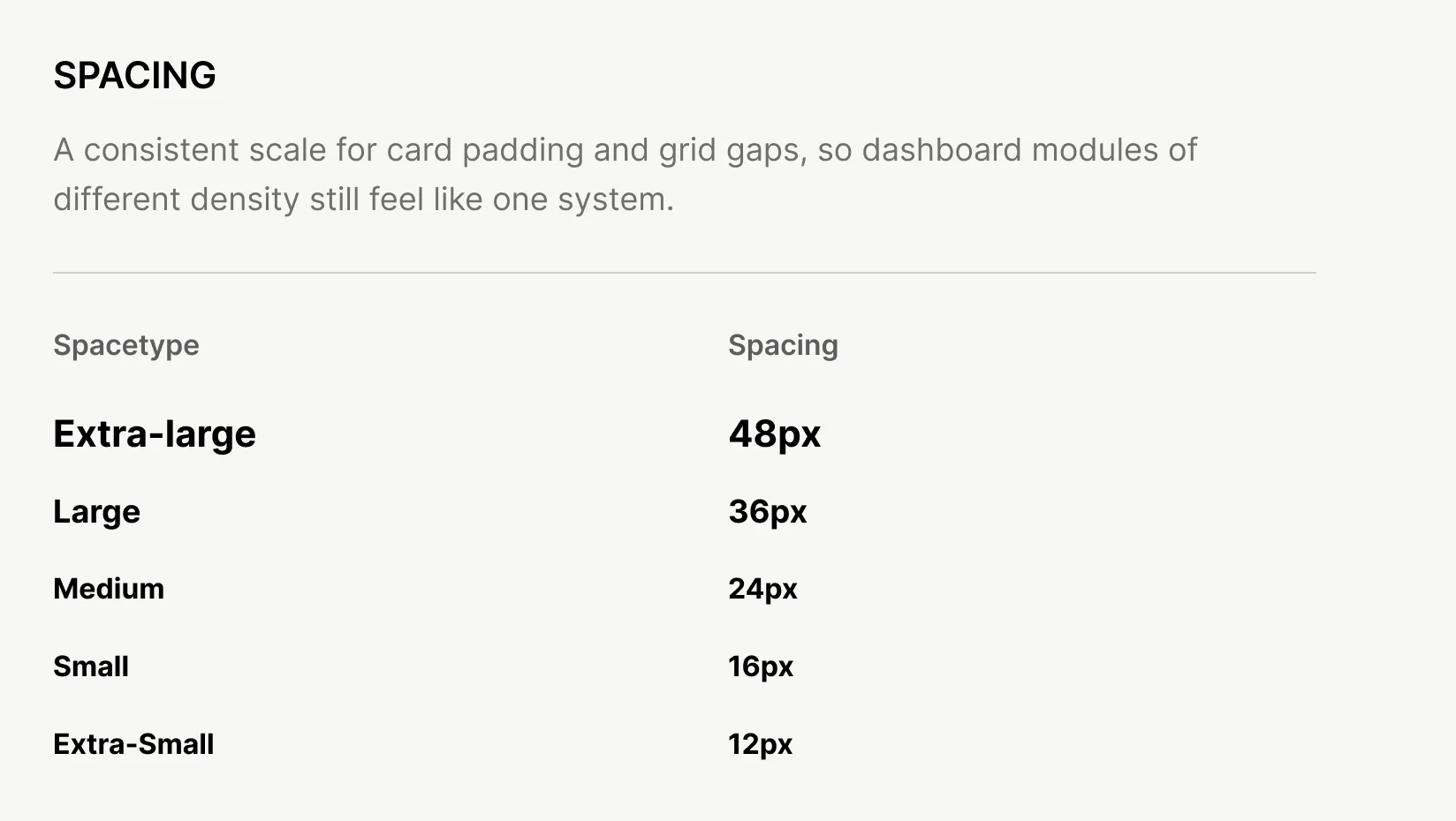
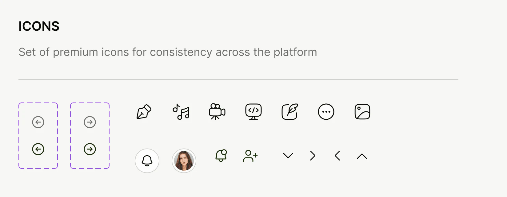
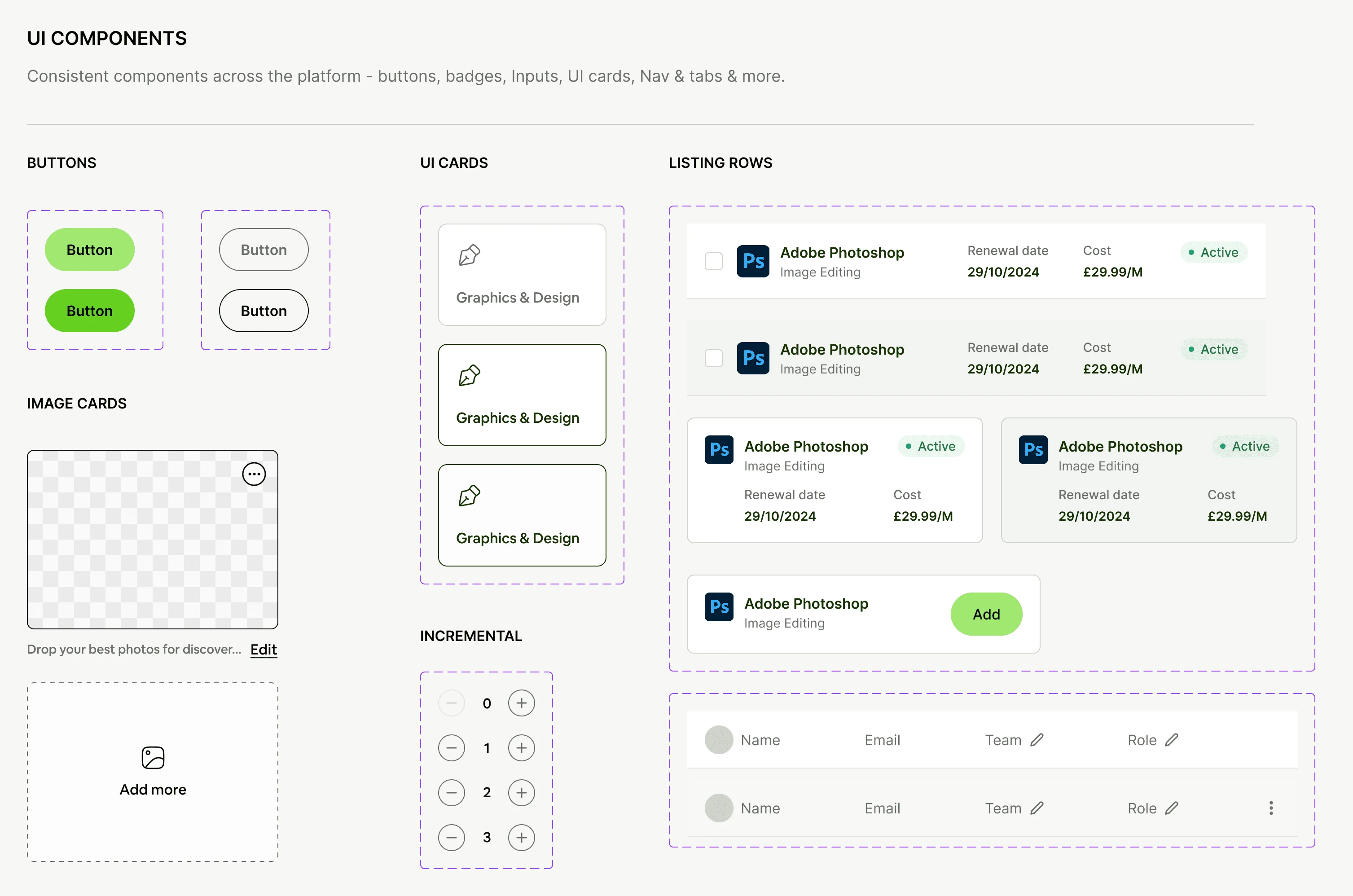
Tokens and reusable components were established early so individual and company views could share one visual language without screen-by-screen rework. The system includes colour roles, typography, a spacing scale, icons and reusable interface patterns.
09 — Learning & next validation
Good overviews help people decide what to do next.
The strongest opportunity sits between software ownership, usage and decision-making. Separating individual and company needs early clarified the architecture.
Next validation should test trust in recommendations, willingness to connect tools and expectations around integration security. Earlier wireframing of detailed admin flows would also reduce redundant screens before UI design.
Independent, self-initiated concept. Not deployed; user validation and integrations remain future work.
Next case
Notely
Have an idea
worth making real?
Tell us what you’re building. Let’s find the right next step.